You are using an out of date browser. It may not display this or other websites correctly.
You should upgrade or use an alternative browser.
You should upgrade or use an alternative browser.
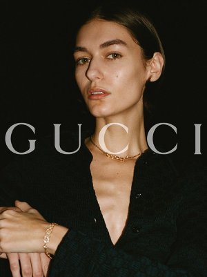
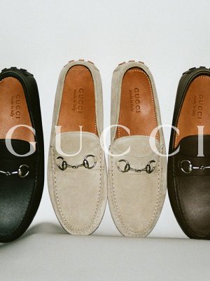
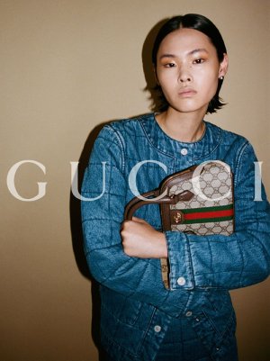
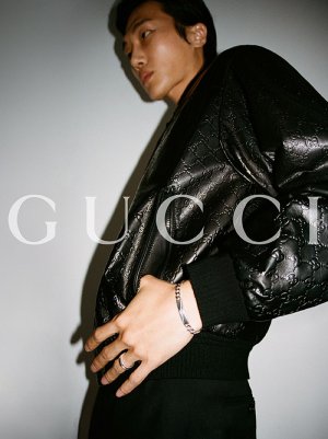
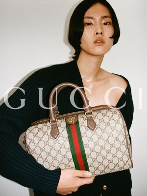
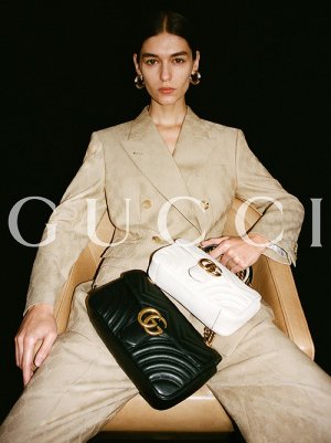
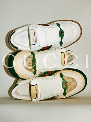
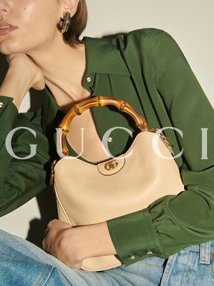
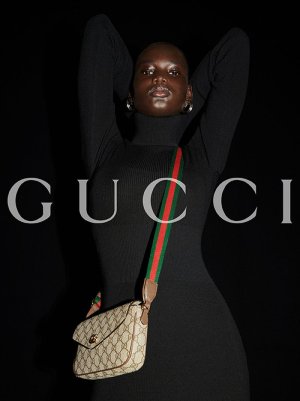
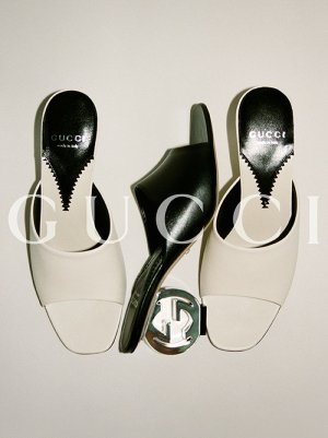
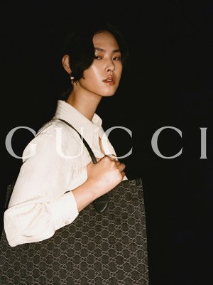
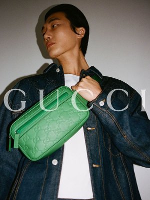
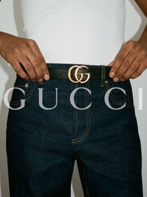
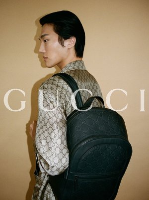
Gucci Resort 2024 by Davit Giorgadze
- Thread starter aguires
- Start date
- Joined
- Jul 14, 2017
- Messages
- 14,420
- Reaction score
- 20,293
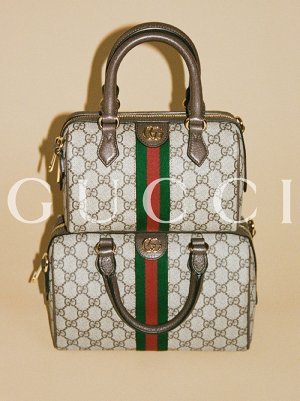
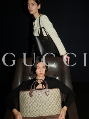
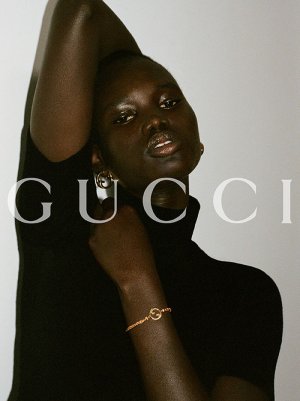
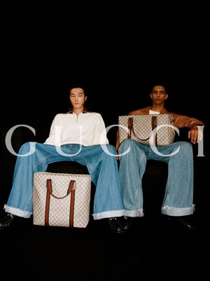
On par with the irrelevant accessory-heavy Gucci campaigns of the early 90s. Items look dated and undesirable and photography looks so unprofessional that better results could've been achieved by an amateur with a hobby camera.
susseinmcswanny
Well-Known Member
- Joined
- May 7, 2020
- Messages
- 1,859
- Reaction score
- 5,062
This new Gucci is so strange. Maybe the idea of this campaign would work better if the merchandise was desirable in a new way, but using the most plain, uninspiring outdated status symbols as a focus of this "new" "quiet luxury" they seem to be going for just reads as a brick wall. It sounds so trite to say but it's completely void of anything; any character, any newness, any humor, any personality. Purely corporate, which somehow Sabato thinks is a "bullsh*t" take. I'm actually kind of flabbergasted.
- Joined
- Jul 14, 2017
- Messages
- 14,420
- Reaction score
- 20,293
Social Media content or official campaign?
I go for the former!
Either way, it's quite bad promotional material. A low-budget production makes sense for social media content, but you'd think they would set their standards a little higher regardless. Influencers with their silly little TikToks are more likely to convince me to buy a product. I've had colleagues with their pitiful student budgets come up with better social media content for school assignments. And although that is no news, retail stores are churning out weekly content that is more attention grabbing. I'm very disappointed with Sabato for this. Not that those inital images of Daria were breaking any new ground, but it was a promising tease that really took us nowhere.
And even if we were to put aside the visual lackings, there's still the problem of uninspired merchandise. I suppose that it still sells for them, a lot of people have a tendency to stick with the classic symbols of obvious wealth. But it baffles me that they haven't modernised or in some way reinvented the unsightly monogram with the red/green stripes. It looks incredibly outdated. And it's become very synonymous with cheapness to me. All the tired looking young people in their ads, but I could never imagine anyone that age willingly carrying such an ugly bag in reality. I'm sure they could do better, it shouldn't be that hard.
MaraPiovani
Active Member
- Joined
- Jul 19, 2018
- Messages
- 102
- Reaction score
- 99
Its like some calvin jeans ad, not high fashion…
According to models.com it's an official campaign.Social Media content or official campaign?
I go for the former!
GivenchyHomme
Well-Known Member
- Joined
- Sep 3, 2009
- Messages
- 5,104
- Reaction score
- 3,799
Total junk. Catalog quality at best. All of these campaigns are doing nothing for the prestige of the brand. It all looks so cheap and juvenile.
tigerrouge
don't look down
- Joined
- Feb 25, 2005
- Messages
- 17,928
- Reaction score
- 7,341
I can see what they're going for - but luxury minimalism has to be luxury to work, with everything considered to a high standard, not low effort and utterly mundane.
My "favourite" shot is the loafers - it should be an easy job to showcase them as desirable merchandise, but instead, they are randomly posed and almost look dirty.
My "favourite" shot is the loafers - it should be an easy job to showcase them as desirable merchandise, but instead, they are randomly posed and almost look dirty.
Lola701
Well-Known Member
- Joined
- Oct 27, 2014
- Messages
- 10,400
- Reaction score
- 19,970
I don’t think they make the difference actually.According to models.com it's an official campaign.
But in terms of marketing release, they are pushing ANCORA. They didn’t bother having an official campaign for the resort collection presented in Asia.
But it’s definitely social media content.
Personally, I don’t mind the photography as much as I do mind about the products photographed.Either way, it's quite bad promotional material. A low-budget production makes sense for social media content, but you'd think they would set their standards a little higher regardless. Influencers with their silly little TikToks are more likely to convince me to buy a product. I've had colleagues with their pitiful student budgets come up with better social media content for school assignments. And although that is no news, retail stores are churning out weekly content that is more attention grabbing. I'm very disappointed with Sabato for this. Not that those inital images of Daria were breaking any new ground, but it was a promising tease that really took us nowhere.
And even if we were to put aside the visual lackings, there's still the problem of uninspired merchandise. I suppose that it still sells for them, a lot of people have a tendency to stick with the classic symbols of obvious wealth. But it baffles me that they haven't modernised or in some way reinvented the unsightly monogram with the red/green stripes. It looks incredibly outdated. And it's become very synonymous with cheapness to me. All the tired looking young people in their ads, but I could never imagine anyone that age willingly carrying such an ugly bag in reality. I'm sure they could do better, it shouldn't be that hard.
I think ANCORA Man is going for a more approachable, almost basic aesthetic. Yes it could have been done in a more pleasing way like the Daria campaign but it has that Tyrone Lebon/Ezra Petronio vibe I love.
What those heavily branded campaigns showcases is how dated and undesirable Gucci classic products are. It’s weird, despite not being a monogram person, I like Vuitton’s LV.
Tell me those are outlets products and I believe you!
Similar Threads
- Replies
- 14
- Views
- 2K
- Replies
- 9
- Views
- 2K
- Replies
- 19
- Views
- 6K
- Replies
- 5
- Views
- 1K
Users who are viewing this thread
Total: 2 (members: 0, guests: 2)


