
-
The Red Carpet Highlights of... The 77th Annual Cannes Film Festival 2024!
You are using an out of date browser. It may not display this or other websites correctly.
You should upgrade or use an alternative browser.
You should upgrade or use an alternative browser.
Magazine Re-Designs
- Thread starter ellastica
- Start date
Benn98
Well-Known Member
- Joined
- Aug 6, 2014
- Messages
- 42,531
- Reaction score
- 20,538
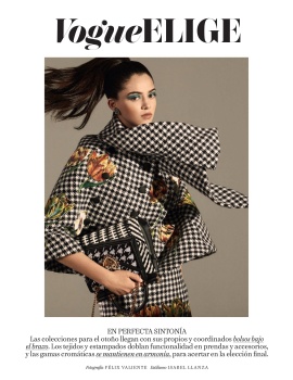
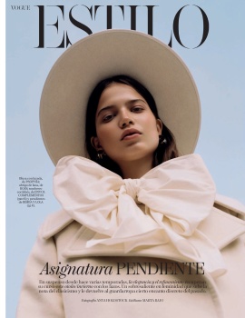
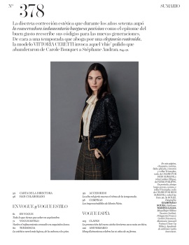
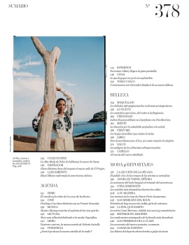
Soft design upgrade at Vogue Spain, only the front section.
Previously Vogue Elige (left) is now Vogue Estilo, with a new font and massive 'cover-like' design. I don't know whether I like it or loathe it, but it looks very Harper's Bazaar, imo. The entire section is also more cohesive and includes the jewellery edit, but they still insist on the odd fascination to pair italic with caps in one sentence.
Vogue Spain Digital Edition

- Joined
- Jul 14, 2017
- Messages
- 14,406
- Reaction score
- 20,209
I wonder if Vogue Paris will have a redesign for their 1000th issue
If the cover design is any indication of what they'd do as a redesign inside, I sincerely hope they don't touch anything.
Phuel
Well-Known Member
- Joined
- Feb 18, 2010
- Messages
- 5,476
- Reaction score
- 7,682
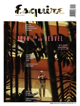
British Esquire steaming ahead with their new cover direction, and I must admit I'm liking it. My only worry is that it won't appeal to the greater public.
Covers since the re-design:
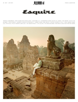
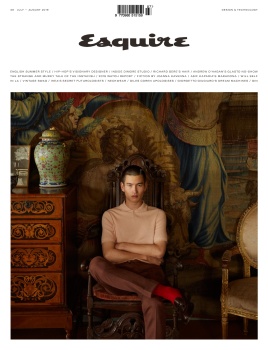
And upon research, it is actually similar to the Dutch edition....
The Official Men's Magazine Thread
I do love that UK cover with the Chinese model. He’s likely the first Chinese model to get me excited since Takeshi Kaneshiro.
Some of the Asian and European Esquire redesigns are supreme— I especially like the Dutch cover. Unfortunately, it’s more a case of strong covers and art direction, but the content is still on the still-for-a-conservative-hetero-reader sensibility. Still, they’re much more willing to push creativity more than the useless American Esquire, which may as well be merged with Rolling Stone magazine. American publications have been generally so useless this decade.
Benn98
Well-Known Member
- Joined
- Aug 6, 2014
- Messages
- 42,531
- Reaction score
- 20,538
I do love that UK cover with the Chinese model. He’s likely the first Chinese model to get me excited since Takeshi Kaneshiro.
Some of the Asian and European Esquire redesigns are supreme— I especially like the Dutch cover. Unfortunately, it’s more a case of strong covers and art direction, but the content is still on the still-for-a-conservative-hetero-reader sensibility. Still, they’re much more willing to push creativity more than the useless American Esquire, which may as well be merged with Rolling Stone magazine. American publications have been generally so useless this decade.
He's Chinese? I didn't know. But what about Zhengyang Zhang!?! No, it's not just the hair that makes me go ooh lol, there's more there. He's like a Tony Thornburg with edge. I think the industry is trying really hard to hype Zhang Wenhui as the top Asian male model but I personally find him a bit pedestrian in the looks department. Just like Kohei, the guy which you're talking about. Yikes, do I suddenly care about male models???
UK Esquire is in a field of its own in the British market. They currently have no rival. I wasn't too chuffed with the first redesign issue, but eventually, I got on board. Completely agree about the heteronormative content in men's magazines in general. Many times I get lured by progressive looking covers only to find the content is all booze and babes, but with luxury watches. Sometimes the editorials differ like night and day from the rest of the content - see Men's Uno, August Man etc.
Benn98
Well-Known Member
- Joined
- Aug 6, 2014
- Messages
- 42,531
- Reaction score
- 20,538
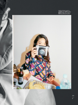
So for the February issue, Vogue Japan got rid of the 'paintbrush' font which they've been using on their fashion and beauty editorials for years. This is the third change so far - we've seen the digital white backdrop disappear for the past three issues and that has been their signature for a long time, there's a pastel blue border appearing throughout most of the written content which makes no difference because the layout is still cluttered and messy, and now this new editorial heading font change. And while they have experimented with different backdrops in the past (usually only for 1 cover), this is the first time we've seen it back to back for 3 consecutive issues.
I am glad they are doing more double-page openings to location editorials.
Not sure whether this is part of a larger re-design which will be announced in the coming months, or whether they're just tweaking.
Before:
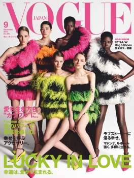
After:
They've toyed with a different font for the November issue which I much prefer to the one above!

Vogue Japan Digital Edition
I am glad they are doing more double-page openings to location editorials.
Not sure whether this is part of a larger re-design which will be announced in the coming months, or whether they're just tweaking.
Before:
After:
They've toyed with a different font for the November issue which I much prefer to the one above!
Vogue Japan Digital Edition
Benn98
Well-Known Member
- Joined
- Aug 6, 2014
- Messages
- 42,531
- Reaction score
- 20,538
Amica Italy also tried a major overhaul for their January 2020 cover, and seemingly the cover alone because I couldn't spot any changes inside the magazine. They've gone for the 'book' type layout which is all the rage right now, and I must say it suits them. Headline font can be better, but the cover as a whole looks appealing imo. Part of me do think that it's maybe bit too 'out there' for their readers......
Before VS After
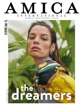
Amica Digital Edition
Before VS After
Amica Digital Edition
Benn98
Well-Known Member
- Joined
- Aug 6, 2014
- Messages
- 42,531
- Reaction score
- 20,538
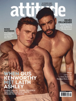
Lastly, Attitude had a similar re-design for their cover which happened immediately after Gay Times announced they would freshen up their pages. Doubt it's a coincidence.
Before VS After
So now we have all these magazines with near-identical layouts. Who's next? Lol
British Esquire
Dutch Esquire
Corriere Della Sera Men's Fashion supplement
Via The Official Men's Magazines thread
Before VS After
So now we have all these magazines with near-identical layouts. Who's next? Lol
British Esquire
Dutch Esquire
Corriere Della Sera Men's Fashion supplement
Via The Official Men's Magazines thread
Benn98
Well-Known Member
- Joined
- Aug 6, 2014
- Messages
- 42,531
- Reaction score
- 20,538
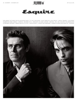
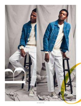
US Esquire redesign under new EIC
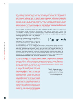
Nothing revolutionary in terms of design, but the new Esquire does feel more cohesive. This specific issue is themed around 'fame', so the cover story and some content tie in with that.
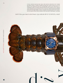
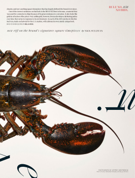
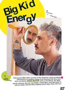
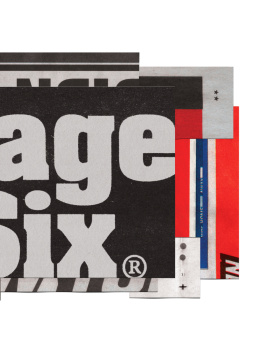
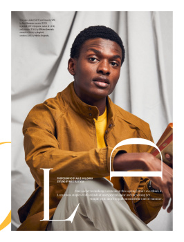
Fielden's front section had at quite a few pages reserved for restaurants, dining trends, a lot of blurbs and collages of 'how-to' servicey tips, city guides. That's all gone now and replaced half the amount of pages for mainly fashion shopping. Not a single grooming feature could be found in this issue. I guess as with US GQ we have to go online for that now? Also a lot more political reporting, and also a take-down on Page Six which I imagine is some sort of revenge for all the negative reporting they've been doing on Esquire. Nick Sullivan is still CD so I doubt much will see an end to those dull as dishwater studio edits he does month after month.
Before VS After
Cover:
 [URL='http://imgbox.com/hOa93nPB']
 [/URL]
Table of Contents
Before
After

Editor's Letter before vs after:
 [URL='http://imgbox.com/ouCEzwoq']
 [/URL]
Front section:
Before


After
Cover Feature intro
Before

After

Main feature intro
Before

After

Fashion editorial intro
Before


After
Final feature before vs after

US Esquire Digital Edition
Nothing revolutionary in terms of design, but the new Esquire does feel more cohesive. This specific issue is themed around 'fame', so the cover story and some content tie in with that.
Fielden's front section had at quite a few pages reserved for restaurants, dining trends, a lot of blurbs and collages of 'how-to' servicey tips, city guides. That's all gone now and replaced half the amount of pages for mainly fashion shopping. Not a single grooming feature could be found in this issue. I guess as with US GQ we have to go online for that now? Also a lot more political reporting, and also a take-down on Page Six which I imagine is some sort of revenge for all the negative reporting they've been doing on Esquire. Nick Sullivan is still CD so I doubt much will see an end to those dull as dishwater studio edits he does month after month.
Before VS After
Cover:
[URL='http://imgbox.com/hOa93nPB'] [/URL] Table of Contents
Before
After
Editor's Letter before vs after:
[URL='http://imgbox.com/ouCEzwoq'] [/URL] Front section:
Before
After
Cover Feature intro
Before
After
Main feature intro
Before
After
Fashion editorial intro
Before
After
Final feature before vs after
US Esquire Digital Edition
Benn98
Well-Known Member
- Joined
- Aug 6, 2014
- Messages
- 42,531
- Reaction score
- 20,538
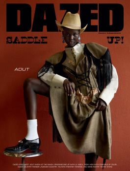
Dazed redesign
I was expecting something really elaborate, this is actually very underwhelming. The flow of content is still mainly the same - front section filled with musicians, actors, writers and so forth in single-brand edits (advertorials!) a short fashion and beauty edit, the cover feature and main fashion content, closing edit which usually goes to a seasoned icon such as Kim Gordon, Skin from Skunk Anansie etc. For the 'redesign' they've just basically ran an update of fonts and positioning. Plus there are certainly a lot more articles and pictorials on cultural icons, as opposed to just more fashion edits, which they're probably hoping would make the issue more 'collectable'.
Cover
 [URL='http://imgbox.com/CACb0sBK']
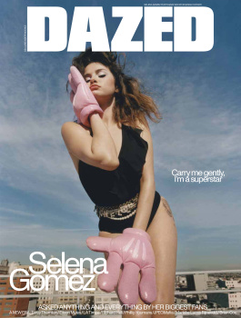 [/URL]
Table of contents
 [URL='http://imgbox.com/VvlLobEm']
 [/URL]
New - Issue theme preview

Editor's letter
 [URL='http://imgbox.com/GQ8orz19']
 [/URL]
Front section edit
Before

After
Cover feature
Before
After

Main fashion feature
Before
After
My only real annoyance is the fashion edit titles written in faint font right and the foot of the opening pages, plus there's a title on each page. Very confusing, unless it's supposed to be 'ironic' LOL.

Closing pages

Dazed Digital Edition
I was expecting something really elaborate, this is actually very underwhelming. The flow of content is still mainly the same - front section filled with musicians, actors, writers and so forth in single-brand edits (advertorials!) a short fashion and beauty edit, the cover feature and main fashion content, closing edit which usually goes to a seasoned icon such as Kim Gordon, Skin from Skunk Anansie etc. For the 'redesign' they've just basically ran an update of fonts and positioning. Plus there are certainly a lot more articles and pictorials on cultural icons, as opposed to just more fashion edits, which they're probably hoping would make the issue more 'collectable'.
Cover
[URL='http://imgbox.com/CACb0sBK'] [/URL] Table of contents
[URL='http://imgbox.com/VvlLobEm'] [/URL] New - Issue theme preview
Editor's letter
[URL='http://imgbox.com/GQ8orz19'] [/URL] Front section edit
Before
After
Cover feature
Before
After
Main fashion feature
Before
After
My only real annoyance is the fashion edit titles written in faint font right and the foot of the opening pages, plus there's a title on each page. Very confusing, unless it's supposed to be 'ironic' LOL.
Closing pages
Dazed Digital Edition
JPineapple
Well-Known Member
- Joined
- Jul 1, 2018
- Messages
- 2,702
- Reaction score
- 3,757
The closing pages of the new design of Dazed look like i-D before its new direction.
Benn98
Well-Known Member
- Joined
- Aug 6, 2014
- Messages
- 42,531
- Reaction score
- 20,538
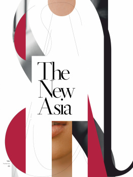
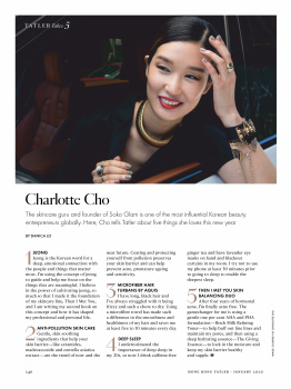
Tatler Asia redesign
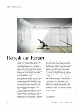
With Joe Zee recently appointed as artistic director, Tatler Hong Kong, Singapore, China, Taiwan, Malaysia, Philippines, Thailand, and Indonesia took the Carine/Bazaar model one step further by unifying not only their main editorial but also the covers and content. Apparently each month a theme will be selected and local teams will work towards that while each edition will select a cover from Joe's main edit. Basically Joe would oversee all 8 editions, with a deputy editor in each country reporting directly to him.
The publisher went to great lengths to bang on about how the new Tatler is much more understated and how they're targeting a new consumer and moving away from the crass excess of the previous Tatler which was based on the UK edition, and how great it is for the region to be unified. But most of us on TFS would know that it's really just a way to trim operating costs above all else. Instead of shooting 2 edits per issue you would now only need to shoot maybe 4 and spread it across.
Regarding the 'moving away from the excess in favour of a new inclusive Tatler' bit... articles like 'Tatler's Guide to Building Your Own Museum' seem plucked straight out of US Town & Country.....
HK cover, before and after,
...which is really the strongest part of their redesign. It no longer looks like a free airline magazine with outdated fonts, and the minimalist direction works for both full-body and portrait shots.
 [URL='http://imgbox.com/VI89gwaT']
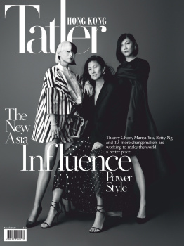 [/URL]
Table of Contents
Before

After
Editor's Letter (Before) vs Publisher's Letter (After)
Amazed Joe Zee didn't get the opportunity to introduce the issue, his direction and the plan ahead, but then the publisher seems like one of those suits who are desperate to be in the spotlight. The very first article in the issue is one of those party scene type photo stories featuring this publisher and his wife hosting a party at a swanky eatery for a bunch of heavy hitters.
 [URL='http://imgbox.com/Z70hFaq0']
 [/URL]
Main Features Intro
Before (this particular issue was themed around wellness)

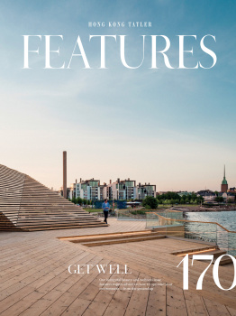
After (themed after the new Asian establishment)
Cover Feature
Before


After

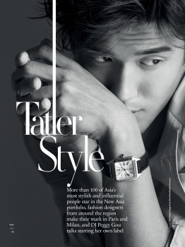
Fashion Editorial intro
Before


After
This issue came with a ridiculous amount of jewellery, watches and accessories but hardly an actual fashion editorial. which is unseemly for the month of March.


Main Feature Intro
Before
After

Final feature before vs after
Hong Kong Tatler Digital Edition
With Joe Zee recently appointed as artistic director, Tatler Hong Kong, Singapore, China, Taiwan, Malaysia, Philippines, Thailand, and Indonesia took the Carine/Bazaar model one step further by unifying not only their main editorial but also the covers and content. Apparently each month a theme will be selected and local teams will work towards that while each edition will select a cover from Joe's main edit. Basically Joe would oversee all 8 editions, with a deputy editor in each country reporting directly to him.
The publisher went to great lengths to bang on about how the new Tatler is much more understated and how they're targeting a new consumer and moving away from the crass excess of the previous Tatler which was based on the UK edition, and how great it is for the region to be unified. But most of us on TFS would know that it's really just a way to trim operating costs above all else. Instead of shooting 2 edits per issue you would now only need to shoot maybe 4 and spread it across.
Regarding the 'moving away from the excess in favour of a new inclusive Tatler' bit... articles like 'Tatler's Guide to Building Your Own Museum' seem plucked straight out of US Town & Country.....
HK cover, before and after,
...which is really the strongest part of their redesign. It no longer looks like a free airline magazine with outdated fonts, and the minimalist direction works for both full-body and portrait shots.
[URL='http://imgbox.com/VI89gwaT'][/URL]Table of Contents
Before
After
Editor's Letter (Before) vs Publisher's Letter (After)
Amazed Joe Zee didn't get the opportunity to introduce the issue, his direction and the plan ahead, but then the publisher seems like one of those suits who are desperate to be in the spotlight. The very first article in the issue is one of those party scene type photo stories featuring this publisher and his wife hosting a party at a swanky eatery for a bunch of heavy hitters.
[URL='http://imgbox.com/Z70hFaq0'][/URL]Main Features Intro
Before (this particular issue was themed around wellness)
After (themed after the new Asian establishment)
Cover Feature
Before
After
Fashion Editorial intro
Before
After
This issue came with a ridiculous amount of jewellery, watches and accessories but hardly an actual fashion editorial. which is unseemly for the month of March.
Main Feature Intro
Before
After
Final feature before vs after
Hong Kong Tatler Digital Edition
Benn98
Well-Known Member
- Joined
- Aug 6, 2014
- Messages
- 42,531
- Reaction score
- 20,538
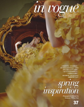
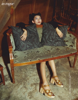
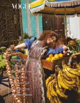
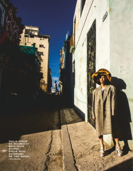
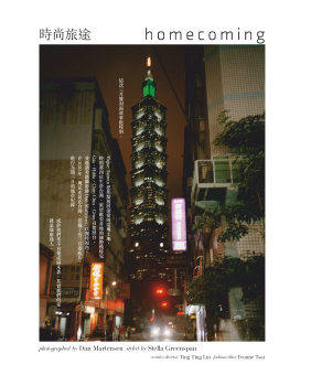
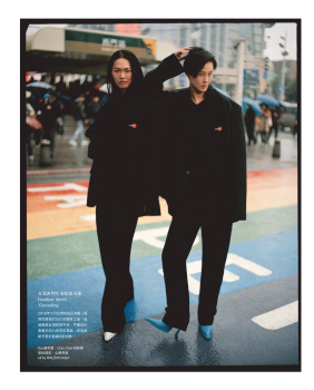
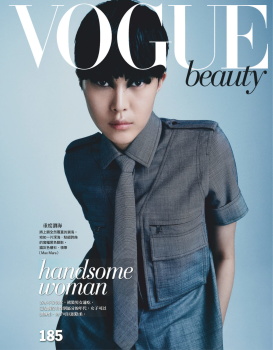
Vogue Taiwan redesign
Defintely a huge improvement from what they used to do. the content as a whole seems lighter and less cluttered, a stronger focus on high fashion with styling from the likes of Stella Greenspan, the absence of native celebrities and replaced with models instead - do hope they'll continue with this. They'll likely lose readers, but if they continue with this direction it could turn out succesful.
Cover, before vs after
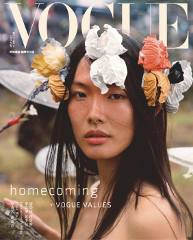
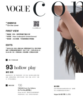
Table of Contents
Before


After
Editor's Letter (new)
The previous EIC hardly bothered publishing a letter in each edition. This time the letter comes with an English translation
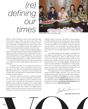

A behind-the-scenes page (new)
Similar to the one US Instyle used to do, and US Marie Currently does.

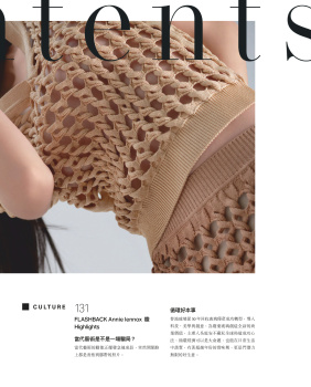
Front of book edit, before
After
Main features into pages, before
After
An interesting move to run English text which gives the magazine a more global touch.

Cover feature, before

After
Fashion edit into, before

After
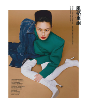
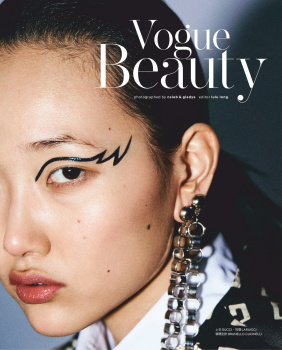
Vogue Beauty, before

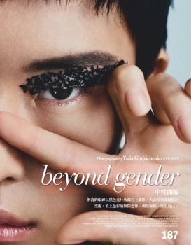
After
Vogue Beauty is still tucked after the main fashion content and still comes with a cover of sorts, but the one downer about their redesign is the choice to layer products on the opening page.

Final feature before vs after

Vogue Taiwan Digital Edition
Defintely a huge improvement from what they used to do. the content as a whole seems lighter and less cluttered, a stronger focus on high fashion with styling from the likes of Stella Greenspan, the absence of native celebrities and replaced with models instead - do hope they'll continue with this. They'll likely lose readers, but if they continue with this direction it could turn out succesful.
Cover, before vs after
Table of Contents
Before
After
Editor's Letter (new)
The previous EIC hardly bothered publishing a letter in each edition. This time the letter comes with an English translation
A behind-the-scenes page (new)
Similar to the one US Instyle used to do, and US Marie Currently does.
Front of book edit, before
After
Main features into pages, before
After
An interesting move to run English text which gives the magazine a more global touch.
Cover feature, before
After
Fashion edit into, before
After
Vogue Beauty, before
After
Vogue Beauty is still tucked after the main fashion content and still comes with a cover of sorts, but the one downer about their redesign is the choice to layer products on the opening page.
Final feature before vs after
Vogue Taiwan Digital Edition
Similar Threads
- Replies
- 32
- Views
- 15K
- Replies
- 32
- Views
- 18K
Users who are viewing this thread
Total: 2 (members: 0, guests: 2)
New Posts
-

-
 A Retrospective : US Harper's Bazaar under Anthony Mazzola (1972–1992) (4 Viewers)
- Latest: susseinmcswanny
-
