
-
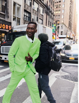
The Red Carpet Highlights of... The 77th Annual Cannes Film Festival 2024!
You are using an out of date browser. It may not display this or other websites correctly.
You should upgrade or use an alternative browser.
You should upgrade or use an alternative browser.
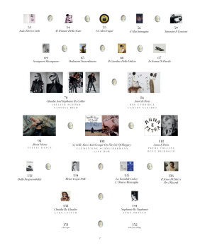
Magazine Re-Designs
- Thread starter ellastica
- Start date


ellastica
Well-Known Member
- Joined
- Jul 7, 2010
- Messages
- 3,546
- Reaction score
- 338
@Benn98 Thanks for contributing to this thread!
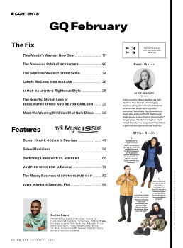
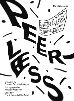
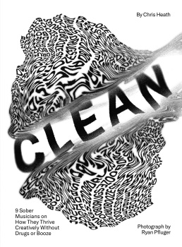
This redesign looks like many things but not a magazine. The contents looks like an retro diner menu, then we get something resembling risograph typography meets doctors eye chart mashup, then some wavy surgeon general warning labels followed up with their riff on the KOOL cigarette logo.
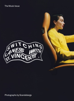
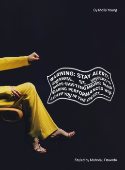
Scandeberg's St Vincent photo shoot (with the exception of that overdone red background image) is well done. Effort was made to think about the graphic impact of the photos on the printed page.
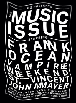
Nobody gives a sh*t about John Mayer.
Not a fan of this new layout. Waaaay too distracting. Type as image is best imo when it's still readable. I can see them trying to merge disparate design influences together except all the of seams are visible rather than a presenting a seamless, exciting new interpretation.
I will check out the written content despite being bombarded by offensively tacky visual elements.
This redesign looks like many things but not a magazine. The contents looks like an retro diner menu, then we get something resembling risograph typography meets doctors eye chart mashup, then some wavy surgeon general warning labels followed up with their riff on the KOOL cigarette logo.
Scandeberg's St Vincent photo shoot (with the exception of that overdone red background image) is well done. Effort was made to think about the graphic impact of the photos on the printed page.
Nobody gives a sh*t about John Mayer.
Not a fan of this new layout. Waaaay too distracting. Type as image is best imo when it's still readable. I can see them trying to merge disparate design influences together except all the of seams are visible rather than a presenting a seamless, exciting new interpretation.
I will check out the written content despite being bombarded by offensively tacky visual elements.
Benn98
Well-Known Member
- Joined
- Aug 6, 2014
- Messages
- 42,531
- Reaction score
- 20,538
@Benn98 Thanks for contributing to this thread!
This redesign looks like many things but not a magazine. The contents looks like an retro diner menu, then we get something resembling risograph typography meets doctors eye chart mashup, then some wavy surgeon general warning labels followed up with their riff on the KOOL cigarette logo.
Scandeberg's St Vincent photo shoot (with the exception of that overdone red background image) is well done. Effort was made to think about the graphic impact of the photos on the printed page.
Nobody gives a sh*t about John Mayer.
Not a fan of this new layout. Waaaay too distracting. Type as image is best imo when it's still readable. I can see them trying to merge disparate design influences together except all the of seams are visible rather than a presenting a seamless, exciting new interpretation.
I will check out the written content despite being bombarded by offensively tacky visual elements.
Only a pleasure!
Re John Mayer, I guess he's there to appeal to the traditional GQ reader, who was probably scared out of his JCrew suit by the sight of Dev and his clique. Lol. The whole John Mayer set is very Esquire for me. Also, he's not a guy to be glorified in general, considering!
Benn98
Well-Known Member
- Joined
- Aug 6, 2014
- Messages
- 42,531
- Reaction score
- 20,538
Wanna talk about a disaster layout, Vogue Italia is raising its hand
Getting odd stares because I just burst out laughing while reading this.

Benn98
Well-Known Member
- Joined
- Aug 6, 2014
- Messages
- 42,531
- Reaction score
- 20,538
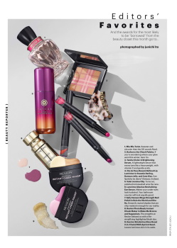
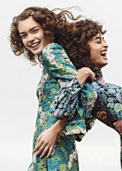
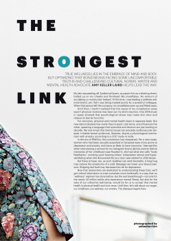
Allure's Michelle Lee on the magazine's new redesign:
'There will be a new typeface for the magazine; younger and more diverse photographers coming in for shoots; a more “beauty forward” approach to editorial content; a dedicated wellness section for the first time; a page called “Cult Object” is coming back after being cut a few years ago; Lee will have her own “My Favorite Product” page, and a series on vanities and bathrooms called “BeautySpaces” is coming in as the new back page. Lee used words like “crisp,” “bright” and “fresh” to describe the look of what’s coming and said she sat down with her editorial team last year “to take a step back, to think about in 2019, who do we want to work with?'
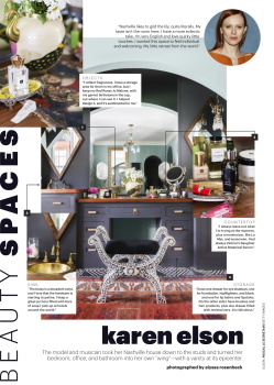
And the results below. Really can't see what's so different from previous issues myself, but ok. Not a fan of celebrity candids used for exclusives. Why go for a red carpet picture of Karen Eleson when Vogue is armed with a library of her shots just gathering dust their archive? Better still, have Karen supply an image if you can't afford to shoot her. But I will say that I've always been partial to a cover editorial outtake used for the index page. Basically, this is nothing new or innovative. This style down to the type is pretty much the norm for most magazines seeking some form of relevance with the youth. So unless Michelle really return to the core of her magazine's history, Allure's fate is sealed.:

Allure Digital Edition
'There will be a new typeface for the magazine; younger and more diverse photographers coming in for shoots; a more “beauty forward” approach to editorial content; a dedicated wellness section for the first time; a page called “Cult Object” is coming back after being cut a few years ago; Lee will have her own “My Favorite Product” page, and a series on vanities and bathrooms called “BeautySpaces” is coming in as the new back page. Lee used words like “crisp,” “bright” and “fresh” to describe the look of what’s coming and said she sat down with her editorial team last year “to take a step back, to think about in 2019, who do we want to work with?'
And the results below. Really can't see what's so different from previous issues myself, but ok. Not a fan of celebrity candids used for exclusives. Why go for a red carpet picture of Karen Eleson when Vogue is armed with a library of her shots just gathering dust their archive? Better still, have Karen supply an image if you can't afford to shoot her. But I will say that I've always been partial to a cover editorial outtake used for the index page. Basically, this is nothing new or innovative. This style down to the type is pretty much the norm for most magazines seeking some form of relevance with the youth. So unless Michelle really return to the core of her magazine's history, Allure's fate is sealed.:
Allure Digital Edition
Last edited:
tigerrouge
don't look down
- Joined
- Feb 25, 2005
- Messages
- 17,905
- Reaction score
- 7,317
When I was leafing through it online, I didn't notice that there'd been any sort of redesign!
ellastica
Well-Known Member
- Joined
- Jul 7, 2010
- Messages
- 3,546
- Reaction score
- 338
I mean weren’t they alreading hiring younger, more diverse editorial crew?
for not wanting to become formulaic, allure looks a lot like what’s already been trending on social media and other mags desperately trying to appeal to the millennials (ahem GQ).
this is far from any reinvention of their previous old, new allure aesthetic. design-wise it still reflects the 80s Memphis, generic Japanese, blue collar gradient California aesthetic mash up trending on social media for the past 7 years or longer. Plenty of overdone design elements on these pages but I wasn’t expecting a drastic change in the first place.
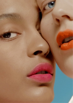
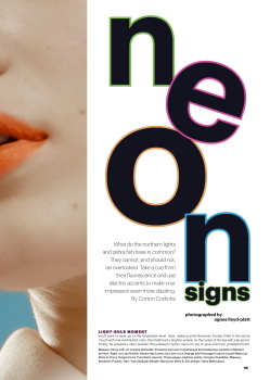
That Neon spread is cool. Just not that different!
for not wanting to become formulaic, allure looks a lot like what’s already been trending on social media and other mags desperately trying to appeal to the millennials (ahem GQ).
this is far from any reinvention of their previous old, new allure aesthetic. design-wise it still reflects the 80s Memphis, generic Japanese, blue collar gradient California aesthetic mash up trending on social media for the past 7 years or longer. Plenty of overdone design elements on these pages but I wasn’t expecting a drastic change in the first place.
That Neon spread is cool. Just not that different!
Benn98
Well-Known Member
- Joined
- Aug 6, 2014
- Messages
- 42,531
- Reaction score
- 20,538
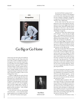
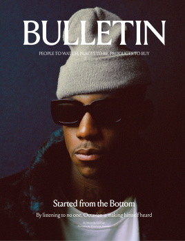
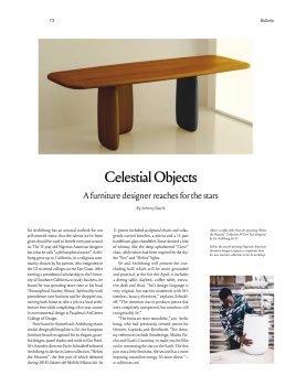
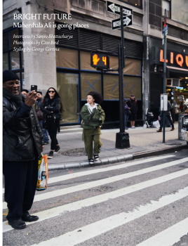
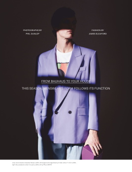
UK Esquire March/April 2019 redesign:
I like the minimalist feel, but to be honest, this edition always had that so it's nothing new. Find a decent copywriter! 'People to watch, Places to be, Products to buy' and 'From Bauhaus to your House'...seriously?
Cover:
Definitely the strongest part of this overhaul.
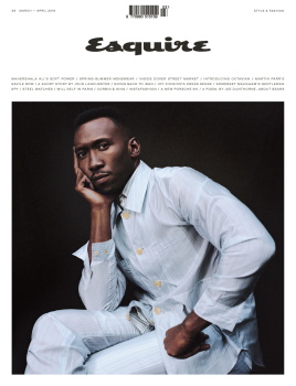
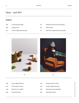
Table of Contents:

Editor's Letter introducing redesign:


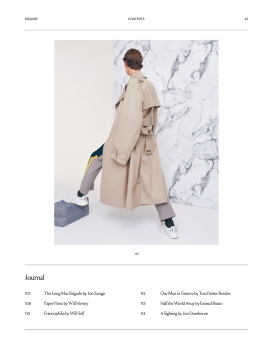
Front of Book cover, and excerpt:
Cover Feature:
I think the positioning of the copy is definitely all wrong. Quite a few times throughout the magazine I've had to look for the headline. It's too faint against busy images. It should either be bigger or bolder.
Main Features:

Quite enjoyed the travel story because not only have they chosen a country which wouldn't be on everyone's radar, but the writeup is honest and informative, giving some travel info as well as the country's turbulent history/current state.


Short Story:

Closing Edit/Back Page:
I think it's too late in the magazine to be posting BTS excerpts from the cover shoot. Yes, it's certainly more entertaining than Marie Claire's version, but overall just underwhelming. Closing edits are important as they round out the issue entirely. This BTS faffle was pointless.

UK Esquire Digital Edition
I like the minimalist feel, but to be honest, this edition always had that so it's nothing new. Find a decent copywriter! 'People to watch, Places to be, Products to buy' and 'From Bauhaus to your House'...seriously?
Cover:
Definitely the strongest part of this overhaul.
Table of Contents:
Editor's Letter introducing redesign:
Front of Book cover, and excerpt:
Cover Feature:
I think the positioning of the copy is definitely all wrong. Quite a few times throughout the magazine I've had to look for the headline. It's too faint against busy images. It should either be bigger or bolder.
Main Features:
Quite enjoyed the travel story because not only have they chosen a country which wouldn't be on everyone's radar, but the writeup is honest and informative, giving some travel info as well as the country's turbulent history/current state.
Short Story:
Closing Edit/Back Page:
I think it's too late in the magazine to be posting BTS excerpts from the cover shoot. Yes, it's certainly more entertaining than Marie Claire's version, but overall just underwhelming. Closing edits are important as they round out the issue entirely. This BTS faffle was pointless.
UK Esquire Digital Edition
caioherrero
Well-Known Member
- Joined
- Sep 2, 2017
- Messages
- 2,870
- Reaction score
- 1,430
But the Redesign of Allure was in the March issue not Feb as posted above ♂️
Benn98
Well-Known Member
- Joined
- Aug 6, 2014
- Messages
- 42,531
- Reaction score
- 20,538
US GQ Style Spring/Summer 2019
I'm not too sure whether this style was introduced in the previous Style issue as I missed it, but it looks like the art direction may have been updated to align with the main edition. But two issues in, and I'm now convinced that this direction does not appeal to me at all. For starters, it's too imposing and aggressive.
The editorial with Caleb is an eyesore. The presentation is laid out in such a servicey, dumbed-down way. Something more suited to the Maxim reader. To think that Welch actually edited GQ Style before taking over from Nelson.

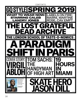
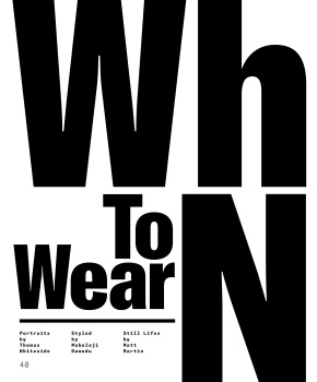
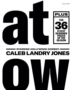
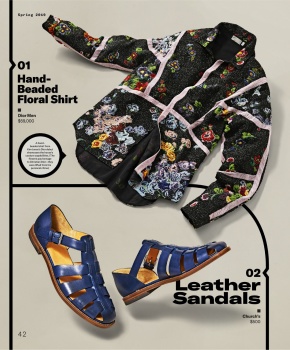


GQ Style Digital Edition
I'm not too sure whether this style was introduced in the previous Style issue as I missed it, but it looks like the art direction may have been updated to align with the main edition. But two issues in, and I'm now convinced that this direction does not appeal to me at all. For starters, it's too imposing and aggressive.
The editorial with Caleb is an eyesore. The presentation is laid out in such a servicey, dumbed-down way. Something more suited to the Maxim reader. To think that Welch actually edited GQ Style before taking over from Nelson.
GQ Style Digital Edition

ellastica
Well-Known Member
- Joined
- Jul 7, 2010
- Messages
- 3,546
- Reaction score
- 338
thanks Ben for your recent contributions.
been laid up for the past 5 days, comatose, getting my @ss handed to me by some viral, hacking, wheezing ball of terror. i can almost compose thoughts.
Mr Welch is not one for understatement. Each page should not resemble a rave poster or Paula Scher tribute or otherwise leave my head spinning.
been laid up for the past 5 days, comatose, getting my @ss handed to me by some viral, hacking, wheezing ball of terror. i can almost compose thoughts.
Mr Welch is not one for understatement. Each page should not resemble a rave poster or Paula Scher tribute or otherwise leave my head spinning.
MissMagAddict
Well-Known Member
- Joined
- Feb 2, 2005
- Messages
- 26,630
- Reaction score
- 1,315
US GQ Style Spring/Summer 2019
The presentation is laid out in such a servicey, dumbed-down way.
It’s dumbed down Neville Brody.
Benn98
Well-Known Member
- Joined
- Aug 6, 2014
- Messages
- 42,531
- Reaction score
- 20,538
It’s dumbed down Neville Brody.
Right! What baffles me is that he actually won an award for that? Wonder who he was up against.
Benn98
Well-Known Member
- Joined
- Aug 6, 2014
- Messages
- 42,531
- Reaction score
- 20,538
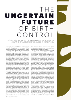
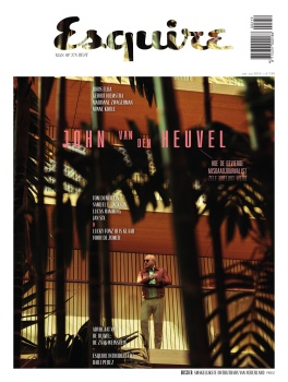
British Esquire steaming ahead with their new cover direction, and I must admit I'm liking it. My only worry is that it won't appeal to the greater public.
Covers since the re-design:
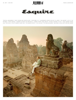
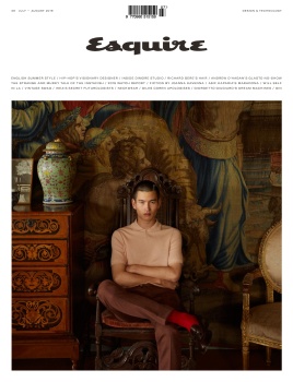
And upon research, it is actually similar to the Dutch edition....
The Official Men's Magazine Thread
Covers since the re-design:
And upon research, it is actually similar to the Dutch edition....
The Official Men's Magazine Thread
Benn98
Well-Known Member
- Joined
- Aug 6, 2014
- Messages
- 42,531
- Reaction score
- 20,538
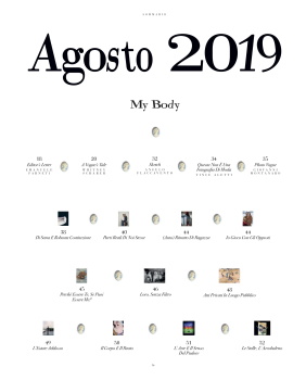
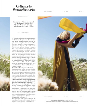
Vogue Italia's re-design....... which actually started from the July issue. I just wasn't sure whether it would be permanent that's why I didn't post:
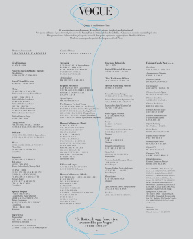
Table of Contents:
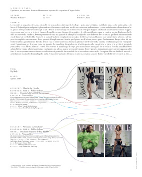
Editor's Letter and Masthead:
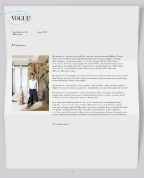
Front of the book start.
Unlike the other Vogues, there's no cover for this section. And Vogue Code, their usual front section editorial, doesnt appear in every issue. But there's way more longform copy and little to zero product shots. The few product plugs are accompanied by copy and not just short blurbs.
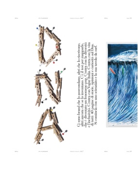
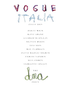
July was themed around DNA.....


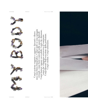
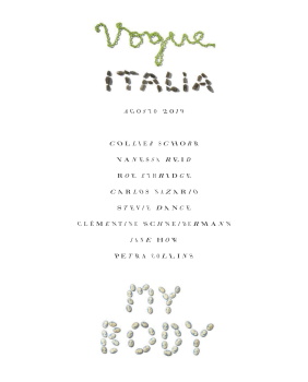
...and August around Body:


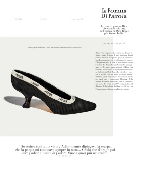
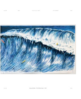
Start to Fashion editorials - in the past a double-page, now only single:
Editorial opening layout:


Beauty: Usually appeared as part of the front section, now moved to back, right after the final fashion editorial. Also, comes with a cover, which is customary to most international Elle, Bazaar, and Vogue issues.
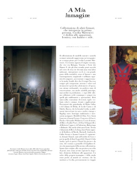
Written main features, after the short beauty section, normally to tie in with the cover star or theme of the issue. Not more than 10 pages:
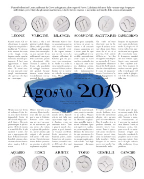
Astrology, which I've never noticed in the magazine before......
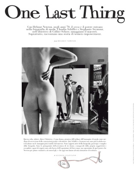
Closing feature/back page:
Vogue Italia Digital Edition
Table of Contents:
Editor's Letter and Masthead:
Front of the book start.
Unlike the other Vogues, there's no cover for this section. And Vogue Code, their usual front section editorial, doesnt appear in every issue. But there's way more longform copy and little to zero product shots. The few product plugs are accompanied by copy and not just short blurbs.
July was themed around DNA.....
...and August around Body:
Start to Fashion editorials - in the past a double-page, now only single:
Editorial opening layout:
Beauty: Usually appeared as part of the front section, now moved to back, right after the final fashion editorial. Also, comes with a cover, which is customary to most international Elle, Bazaar, and Vogue issues.
Written main features, after the short beauty section, normally to tie in with the cover star or theme of the issue. Not more than 10 pages:
Astrology, which I've never noticed in the magazine before......
Closing feature/back page:
Vogue Italia Digital Edition
Last edited:
Benn98
Well-Known Member
- Joined
- Aug 6, 2014
- Messages
- 42,531
- Reaction score
- 20,538
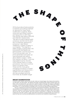
Case in point, their big reveal: "The List." Ground-breaking: Gaudy gold fashion accessories, crammed together between a bunch of italicized, hard to read text. The written word is all fashion cliches which in no way specifically highlights details of the so-called "objects of desire." Unremarkable still-life photography, vague cliched product descriptions, poor typeface choices, no white space, and horrible fashion accessories selection, editing. This page misses the mark on all points: layout, font, photography, editing and writing. Not to mention was this in anyway forward thinking or simply mirroring what's already out there?
Was interesting to read this, because 'The List' has since evolved into the most important staple for all global Harper's Bazaar editions. And they've expanded it from just accessories crammed together, to a short front section editorial. The iterations are oddly formulaic though, only the European editions bother to liven it up by giving it the same level of attention as the main editorial.
Similar Threads
- Replies
- 32
- Views
- 15K
- Replies
- 32
- Views
- 18K
Users who are viewing this thread
Total: 2 (members: 0, guests: 2)