Proenza Schouler S/S 2013 : Julia Nobis and Irina Nikolaeva by David Sims

Flashbang

Mr. Magic
Joined
Oct 14, 2008
Messages
102,937
Reaction score
58
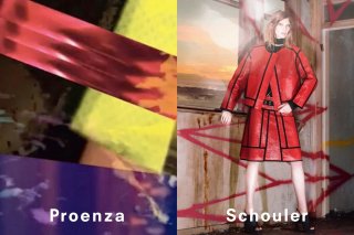
FASHION COLLAGE: Proenza Schouler’s spring campaign marks a couple of firsts for Lazaro Hernandez and Jack McCollough. It’s the first time the duo collaborated with photographer David Sims. It’s also their first campaign to appear in national fashion magazines like the March issues of Vogue, Harper’s Bazaar and W. The visuals – shot at London’s Spring Studios in October and featuring portraits of models Julia Nobis and Irina Nikolaeva juxtaposed with abstract images – have a collagelike touch. The images, which unveil a new brand logo, will also run in European biannuals like Love, Pop, Purple, Self Service and 032c.

wwd.com
 

Attachments

  • memo-proenza-schouler.jpg
    memo-proenza-schouler.jpg
    148 KB · Views: 233
IRINA! :heart: :heart: Made my fashion day with this. YESOMG

I don't know if the pose was supposed to look this robotic - if it was I don't think it worked out. It doesn't stand out to me. AND STOP WITH THE DEFAULT FONT LOGO CHANGES DAGNABBIT.
 
Argh, same stiff pose and fake background as in Sims' Ferragamo campaign (and that recent McQueen campaign). Doesn't do this outfit any favor, at all. And I agree about the ugly font. The "h" disappears into her pale legs, too. Proenza Schouler campaigns are usually among my favorites, but this doesn't look very promising.
 
OMG I thought that wasn't the finished piece and someone else just tacked on "Proenza Schouler" as an identifier for the photo. The logo's so ugly and ruins the campaign! :cry:
 
It looks cheap and sloppy. And don't even get me started on the new "logo".
 
Yes! IRINA!
But no to this stiff campaign, eventhough the clothes are being displayed well. And no to Julia.
 
I thought they would do a Ray of Light music video thing based on the clothes prints, now it's totally underwhelming.
 
The colour is very catching but the pic looks pretty fake and bad. I am excited about Julia's shots though.
 
This looks like a high school photography project gone completely awry. And WTF is up with the font of the logo? I can't believe an amazing photographer like Sims shot this.
 
I really do like the photo on the right but the streaks of color on the opposite page makes this ad dysfunctional. It's very distracting.
 
It looks like an editorial from US Vogue!
 
STOP WITH THE DEFAULT FONT LOGO CHANGES DAGNABBIT.

this. all. day. long.

the old proenza logo was unique and had some character. this looks like it was just typed in by an intern at the last minute...:hardhead:


In a dark and dreamy collage of crocodile prints, perforated leather, and grainy blocks of color, Proenza Schouler has launched their Spring Summer 2013 ad campaign. Australian model Julia Nobis and Russia’s Irina Nikolaeva embody the entity of the brand with chopped and beach-dried dirty blond hair and nude, slightly vacant expressions. The campaign features the quintessential red leather jacket and matching A-line skirt patterned with straight black lines and squares of textured leather to create a heavy, boxed affect. Nobis wears the cut-out knee-high gladiator boots that dominated the footwear on the Spring 2013 runway, while standing in a dilapidated and sun-streaked room. Juxtaposing the futuristic energy of sharp geometric shapes with nearly whimsical hues and domineering textures, the union of these abstract images epitomize the vision behind Proenza Schouler’s Spring collection.


The ads will appear in the March issues of Vogue, W, and Harper’s Bazaar and premiered online today.
bullettmedia.com
 
im actually in love with this..its such a good direction. cant wait for more.
 

Users who are viewing this thread

Forum Statistics

Threads
210,974
Messages
15,135,674
Members
84,737
Latest member
cstmbres
Back
Top
monitoring_string = "058526dd2635cb6818386bfd373b82a4"
<-- Admiral -->