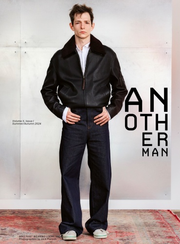
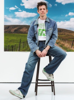
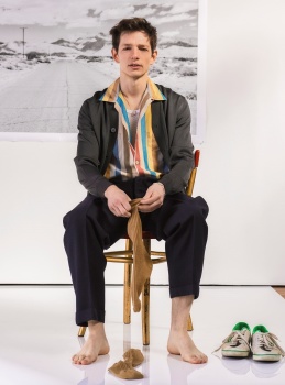
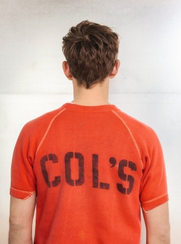
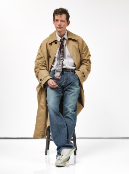
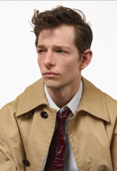
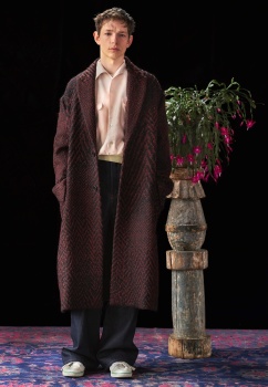
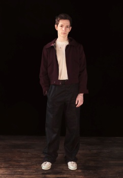
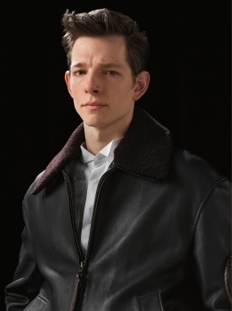
AnOther Man Spring/Summer 2024

I'm of the mind that Faist should only be styled and shot like a young Frank Sinatra.
 
What's with all these crazy logos? Beyond Noise and now this?


Photographer: Jack Pierson
Stylist: Ellie Grace Cumming
Hair: Tsuki
Make-up: Kiki Gifford
Star: Mike Faist


anothermag
 
These would work better for tv promo than a magazine. Those orange prison mugshot like pictures are unfortunate.
 
Volume 2 issue 1??? What?

It appears that they will start publishing AnOther Man as a separate publication again, hence the numeration.

Mike is so far detached from the type of man I'm usually attracted to, but he's so damn cute!! Which is really the only reason why I would be interested to look at these pictures. I'm also not sure how I feel about the artsy redesign, I sort of miss the classic AnOther logo. But I can't say that it looks bad, for this sort of publication.


The Mike Faist "editorial" by Jack Pierson is shockingly bad. It looks like ecomm from when a model goes on stay in Tokyo. Mike is an incredible talent, give the boy a character and a story to play.
 
I received my copy yesterday. I was very excited for the comeback but when I opened the magazine the sensation was bittersweet: editorials and advertorials and editorials and advertorials. The written content is at the end of the issue and like 14-20 pages. Also, they resized the magazine, now the difference between Another and Another Man is huge, the size a little bit larger than 032c,
 
this magazine used to be amazing. the old ones I keep as a treasure now its everything so randow that I dont even know what to say about this issue
 

Users who are viewing this thread

New Posts

Forum Statistics

Threads
210,855
Messages
15,131,542
Members
84,630
Latest member
Dima77
Back
Top
monitoring_string = "058526dd2635cb6818386bfd373b82a4"
<-- Admiral -->