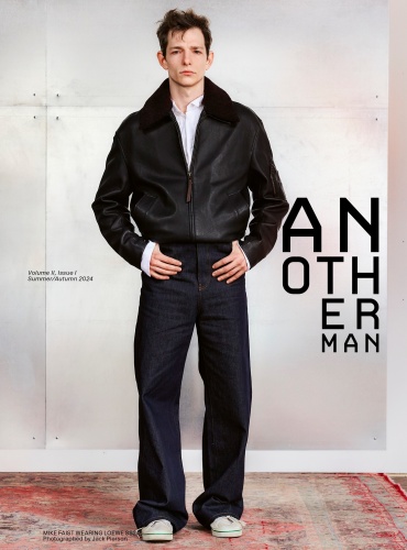
It appears that they will start publishing AnOther Man as a separate publication again, hence the numeration.
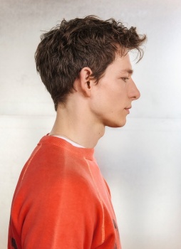
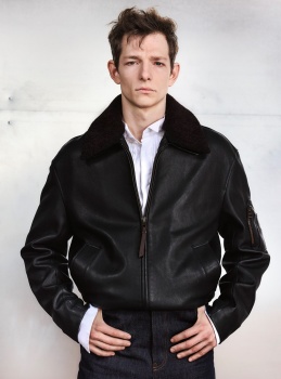
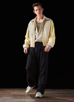
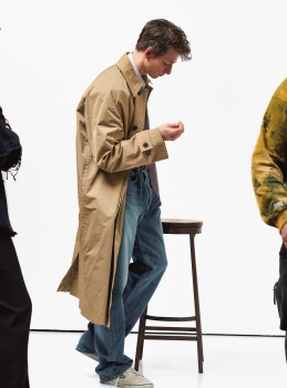
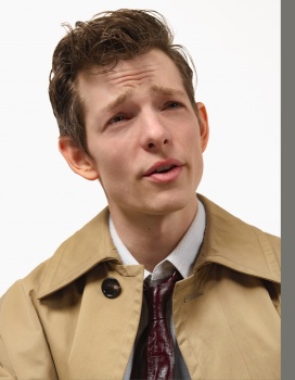
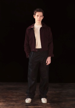
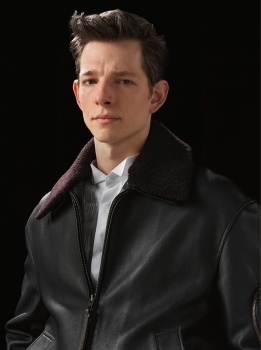
Mike is so far detached from the type of man I'm usually attracted to, but he's so damn cute!! Which is really the only reason why I would be interested to look at these pictures. I'm also not sure how I feel about the artsy redesign, I sort of miss the classic AnOther logo. But I can't say that it looks bad, for this sort of publication.
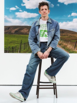
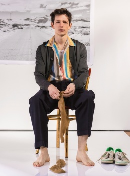
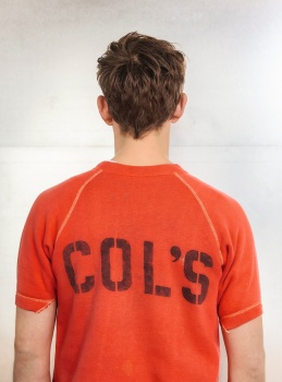
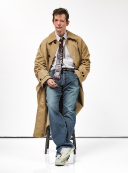
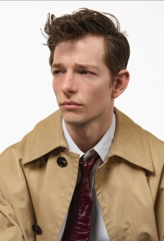
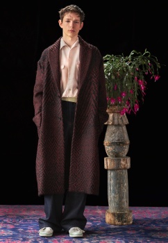
The Mike Faist "editorial" by Jack Pierson is shockingly bad. It looks like ecomm from when a model goes on stay in Tokyo. Mike is an incredible talent, give the boy a character and a story to play.
This site uses cookies to help personalise content, tailor your experience and to keep you logged in if you register.
By continuing to use this site, you are consenting to our use of cookies.