Prada S/S 2024 by Willy Vanderperre

There’s diversity when brands have 3/4 people representing different ethnic groups. With 40 people that are more of the same archetypes of their ethnicity, it’s another case of that boring over-intellectualization of Prada.

Linda Evangelista would have been appreciated really as an OG.
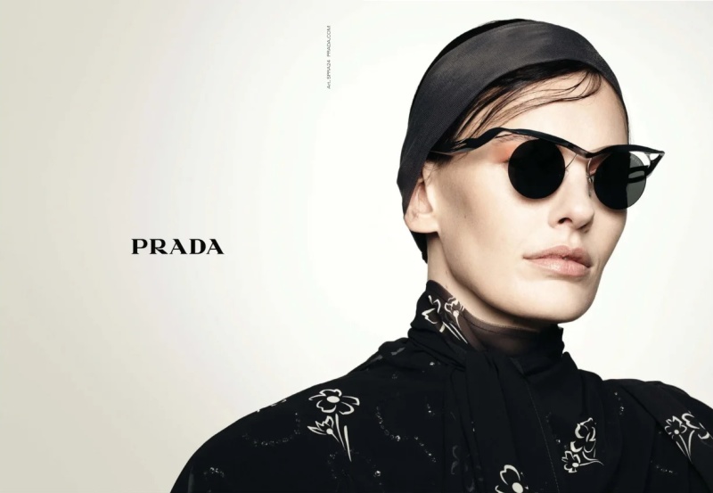
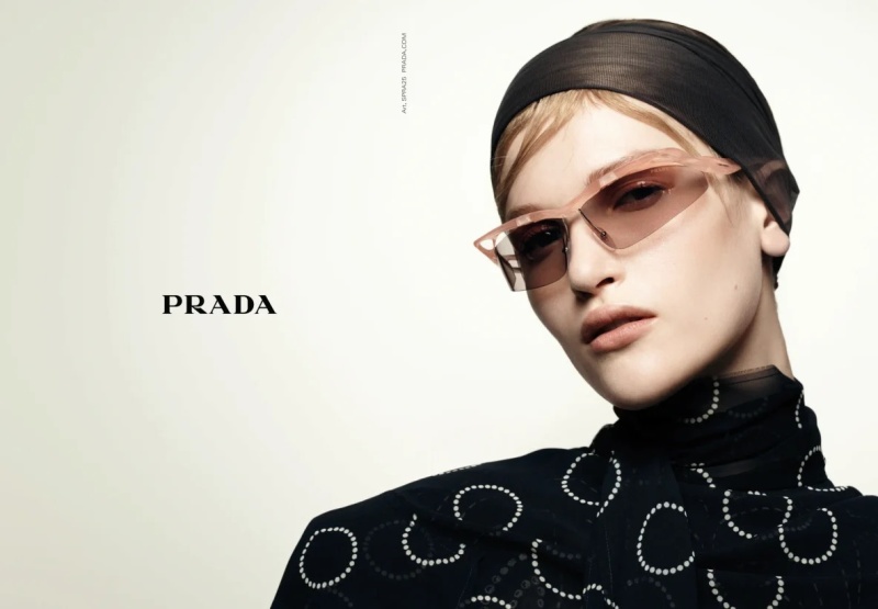
Literally sometimes I lol when I see casting so binary, either white or the darkest black person they could possibly find to check the box. Diversity is great but let it be authentic to the attitude and the type of person in the tribe that wears the clothes.
 
I do like this, and I'm not even a massive Vanderperre fan. Compared to previous Prada advertising campaigns, I'm able to appreciate the simplicity in terms of concept and execution. The portraits themselves are all undeniably beautiful, some better than others, but beautiful nevertheless. Also... Elise Crombez! :heart:
 
I do like this, and I'm not even a massive Vanderperre fan. Compared to previous Prada advertising campaigns, I'm able to appreciate the simplicity in terms of concept and execution. The portraits themselves are all undeniably beautiful, some better than others, but beautiful nevertheless. Also... Elise Crombez! :heart:
I hope the single-page and double-page ads will have one portrait, white space, and the logo. Not multiple portraits on the pages which I never like.
 
Should be only Loli, Lexi, Liu and Harry Dickinson
 
The casting is overwhelming, but I like what was done. Even if it feels like not too far a departure from what Meisel has done with Zara. No disrespect, just saying.
 
the problem with this kind of minimalism is that it stops working when it goes superfluous. i miss the days when there was just a couple of power shots within one campaign, not this nonsense. i refuse clicking the thumbnails when i know the images will all look the same. these are basically compcards.
 
Last edited:
the problem with this kind of minimalism is that it stops working when it goes superfluous. i miss the days when there was just a couple of power shots within one campaign, not this nonsense. i refuse clicking the thumbnails when i know the images will all look the same. these are basically compcards.
And back in the day, some comp cards were FAR more impressive than this! Who could forget some of those Supreme cards?!?
 
Eyewear with Amanda Murphy


VOGUE FRANCE DIGITAL EDITION

& Sascha Rajasalu


VANITY FAIR FRANCE DIGITAL EDITION
 
A beautiful and minimal ad campaign. It is very effective in print. I love all of the ads that bleed the images from edge to edge on the printed page.
 

Users who are viewing this thread

New Posts

Forum Statistics

Threads
210,771
Messages
15,127,639
Members
84,505
Latest member
theaucourant
Back
Top
monitoring_string = "058526dd2635cb6818386bfd373b82a4"
<-- Admiral -->