the dimensions of the magazine are much slimmer than other issues.
It’s about 1cm x 0.5cm smaller than UK vogue, but their March and Sept new layout is about 2cm wider than a normal issue.
god knows why!
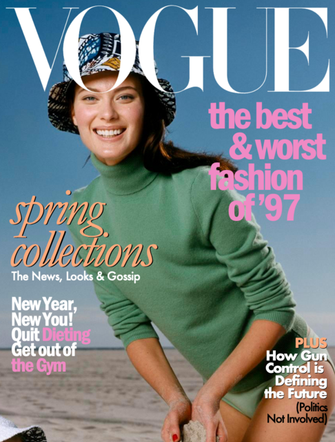
I also LOVE making the stupid cover lines. The more cheesy they are the better! (I do steal ones from real Vogue Issues too)