Sorry, but the average DMV employee dresses nicer than this.I hadn't thought that if I always hated Céline campaigns and this will be the main form of communication, that I will always have to dig through the visual trash just to get to the good part, UGHHH.
Some things I found tempting enough to just.. enter the digits (like the cherry [?] trousers), but like Lola, I don't like them enough to buy them compulsively or under pressure, they just didn't bring that urge in me, and I might be petty but some of these takes on 'rawness'..
View attachment 1240026
phoebephilo.com
Corporate life wrinkles sure.. but that's literally state employee/call center butt. It's not aspirational.
You are using an out of date browser. It may not display this or other websites correctly.
You should upgrade or use an alternative browser.
You should upgrade or use an alternative browser.
Phoebe Philo F/W 2023.24
- Thread starter LadyJunon
- Start date
MulletProof
Well-Known Member
- Joined
- Apr 18, 2004
- Messages
- 28,163
- Reaction score
- 5,599
lol I was going to disagree but never forget the DMV guy who failed me 2 minutes into my driving test and he was in this odd but admittedly intimidating head-to-toe light blue number (light blue shoes, light blue jeans, light blue cashmere sweater, some kind of light blue scarf, perfectly combed hair).Sorry, but the average DMV employee dresses nicer than this.
Being sold out means she sold a lot…It means she sold the stocks of items made, simple as that.
It’s a small company so we can’t expect the scales to be the same as they were for Celine and Chloe. And they were very upfront about the fact that they will deliberately limit quantities.
But then again, being sold out means that her customers are responding favorably to what she is proposing. They still got a long way to go. The brand has to be profitable…Even if I think that she will close the brand when she retires.
Totally!
Hello everyone,
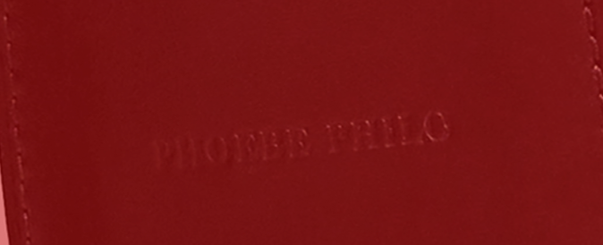
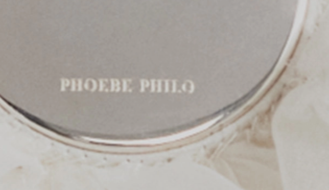
I am interested in how the logotype has been deployed on the garments. The stacked, two-lined logotype struck me as deliberately weird and consciously unconventional from the very beginning.
I am uploading two images where another iteration of the logotype can be seen. I would like to know if someone knows about the actual size, proportions and general use of the logotype on shopping bags or any other medium that has to be branded.
Note: Sadly, I haven't been able to get images with higher resolutions for the moment.


Turnip Rutabaga
Member
- Joined
- Oct 6, 2020
- Messages
- 24
- Reaction score
- 43
In reality these pieces go to collectors, not so much to real life. If trousers and coats look oversize on a 180cm model, only desparate fashion week "streetstyle" trotters are willing to wear them as it is. Some may buy these garments only as investments because, as from the very first PP collection, they have value in the future.
Perhaps her core clientele actually likes that the fit seems to flatter women of a certain height, way above the usual standard sizing in womenswear. She certainly seems interested in creating designs with a strong vertical stress that elongate the figure.In reality these pieces go to collectors, not so much to real life. If trousers and coats look oversize on a 180cm model, only desparate fashion week "streetstyle" trotters are willing to wear them as it is. Some may buy these garments only as investments because, as from the very first PP collection, they have value in the future.
ecnerretneerg
Well-Known Member
- Joined
- Jan 18, 2020
- Messages
- 168
- Reaction score
- 712
Seems like I’m alone on this, but I love the logo and font.
I really like the debut, but I have some qualms:
- the jodhpur boots are super ugly
- the hardware on the bags cheapen the design, especially on the Gig (I encourage anyone who considers purchasing one to just find a old Celine trio)
- the Mum necklace looks fresh out of a 3D printer
I really like the debut, but I have some qualms:
- the jodhpur boots are super ugly
- the hardware on the bags cheapen the design, especially on the Gig (I encourage anyone who considers purchasing one to just find a old Celine trio)
- the Mum necklace looks fresh out of a 3D printer
GoldenPetals
Well-Known Member
- Joined
- Jul 4, 2020
- Messages
- 498
- Reaction score
- 1,216
I appreciate her work a lot even though it's not aesthetically hit and miss for me personally. I do think that she's one of the reigning champions of minimal luxury.
SHE'S someone I'd love to see at Helmut Lang
SHE'S someone I'd love to see at Helmut Lang
Lola701
Well-Known Member
- Joined
- Oct 27, 2014
- Messages
- 10,432
- Reaction score
- 20,130
This is RTW after all. Commercial RTW. This is not CDG mainline or Ligne Artisanale Margiela. Those are clothes to wear.In reality these pieces go to collectors, not so much to real life. If trousers and coats look oversize on a 180cm model, only desparate fashion week "streetstyle" trotters are willing to wear them as it is. Some may buy these garments only as investments because, as from the very first PP collection, they have value in the future.
I’m not talking only because I bought 2 pieces and still wears her Celine but in reality, I think people who are willing to buy HF in that aspect (beyond the prices) are buying it to live with it.
I don’t know about the style of the so-called Philophiles, but personally, I don’t subscribe to that caricature it is. I like clothes that fits my lifestyle and I think there’s something familiar and yet bold in terms of cut in what she is proposing.
I think that her aesthetic goes beyond the so-called fans or people who mourned her and went to The Row or whatever. I’ve never bought The Row for example. I subscribe to a singular vision lol.
LadyJunon
Well-Known Member
- Joined
- Dec 11, 2021
- Messages
- 3,185
- Reaction score
- 5,892
I feel that the fans who were satisfied with The Row enjoyed Philo's work because it was minimal, pragmatic and cool, but never really acknowledged the actual artistry behind her vision for Céline.This is RTW after all. Commercial RTW. This is not CDG mainline or Ligne Artisanale Margiela. Those are clothes to wear.
I’m not talking only because I bought 2 pieces and still wears her Celine but in reality, I think people who are willing to buy HF in that aspect (beyond the prices) are buying it to live with it.
I don’t know about the style of the so-called Philophiles, but personally, I don’t subscribe to that caricature it is. I like clothes that fits my lifestyle and I think there’s something familiar and yet bold in terms of cut in what she is proposing.
I think that her aesthetic goes beyond the so-called fans or people who mourned her and went to The Row or whatever. I’ve never bought The Row for example. I subscribe to a singular vision lol.
I just want to add that I find the imagery really sexy in her way. One of the reasons I find her ahead of the row or any of her alumni is the sexiness of her proposition. There’s crazier items here and there that feel distinctly British and sometimes even a bit sleazy. This aspect she shares with Helmut lang and margiela, who in all their minimalism still had a lot of sex. I’m really happy to have her voice back in fashion.
Frederic01
Well-Known Member
- Joined
- Jun 7, 2021
- Messages
- 1,302
- Reaction score
- 2,376
WALLPAPER.COM/Spanning ready-to-wear, leather goods and accessories, the first edit, A1, will arrive in three drops beginning on 30 October 2023 and over ‘the months that follow’. There are 150 pieces in total. A second edit, A2, will be released in Spring 2024.
Overindulgence
Well-Known Member
- Joined
- Oct 5, 2020
- Messages
- 301
- Reaction score
- 564
I just want to add that I find the imagery really sexy in her way. One of the reasons I find her ahead of the row or any of her alumni is the sexiness of her proposition...This aspect she shares with Helmut lang and margiela, who in all their minimalism still had a lot of sex.
Totally agree with you. I also like the logo.
I enjoy this debut collection a lot, and this is coming from someone who doesn't even dress close to the lifestyle her designs may propose. It establishes Philo's codes in the clothes, accessories, and bags. Overall, I'm very satisfied and look forward to seeing more of the drops and collections. Agreed that she will need a retail presence down the line.
Some of the looks like it's part of Celine world but some of the other looks really push it forward in establishing a slight different mood for her brand (some actually remind of me of Elbaz's Lanvin in its styling/silhouettes). - those are the ones that excite me the most. While her Celine seemed to have catered to the corporate or art gallerist woman, her namesake has an ease, yet still upper class, vibe to it...it offers something for the unapologetically and/or retired wealthy women. Instead of trying to sell art, she's finally relaxing at home that's decked with art.
Are all of the images by Talia Chetrit?
Lola701
Well-Known Member
- Joined
- Oct 27, 2014
- Messages
- 10,432
- Reaction score
- 20,130
Maybe…I feel that the fans who were satisfied with The Row enjoyed Philo's work because it was minimal, pragmatic and cool, but never really acknowledged the actual artistry behind her vision for Céline.
For me, Phoebe’s work has always been different because it was beyond the prism of minimalism. She made prints, wild associations, mixed prints, never shied away from prettiness or even sensuality. It’s. It just big shapes with pockets.
I think if you go to various The Row threads, I’ve always had some kind of problem with that « loungewear » aesthetic. The Row is fabulous to look at but always felt detached for me compared to Max Mara or even Joseph.
I think I have kind of consensual taste when it comes to HF. But I really subscribe to the creative intention. And that’s what sets Philo apart from all the people who copied her. Yes she uses a lot of references but there’s a creative intention behind. A wardrobe composed of basics of so quote « good taste » is my ultimate fear.
I think that what I hate about the idea of the Philophiles and that lineup of brands that are supposed to « fill the void » is that monolith in terms of taste. I don’t think that having a wardrobe of Jil Sander, Celine, Margiela, Lemaire, The Row is that aspirational.
Personally, I don't like the logotype and the font that's been used. But I think that's been a clearly deliberate choice on her part. The jarring shade of red, the stacked lines in the logotype... I think it all signals an attempt at a subversion of the visual codes of luxury fashion.Seems like I’m alone on this, but I love the logo and font.
I really like the debut, but I have some qualms:
- the jodhpur boots are super ugly
- the hardware on the bags cheapen the design, especially on the Gig (I encourage anyone who considers purchasing one to just find a old Celine trio)
- the Mum necklace looks fresh out of a 3D printer
May I ask why do you love the logo and choice of typeface?
I'm actually surprised that none of the online articles that have featured the Phoebe Philo launch today have mentioned the authorship of the photographs.Are all of the images by Talia Chetrit?
Fulton St Critique
Well-Known Member
- Joined
- Apr 27, 2020
- Messages
- 395
- Reaction score
- 762
The chenille knit tops were great. They really made me appreciate the merchandising skillset Philo has.
@jeanclaude How can you hate the leggings!?! Truly luxe! One of my favorite pieces from the collection outside of the obviously beautiful outerwear.
@jeanclaude How can you hate the leggings!?! Truly luxe! One of my favorite pieces from the collection outside of the obviously beautiful outerwear.
Yes. According to Models.com, all the photographs in the lookbook are credited to Talia Chetrit.Are all of the images by Talia Chetrit?
Lola701
Well-Known Member
- Joined
- Oct 27, 2014
- Messages
- 10,432
- Reaction score
- 20,130
The visuals seems to be a mix of Talia Chetrit and Tyrone Lebon.Yes. According to Models.com, all the photographs in the lookbook are credited to Talia Chetrit.
Similar Threads
- Replies
- 108
- Views
- 12K
- Replies
- 108
- Views
- 12K
- Replies
- 97
- Views
- 25K
- Replies
- 7
- Views
- 3K
Users who are viewing this thread
Total: 2 (members: 0, guests: 2)
New Posts
-
US Vanity Fair March 2005 : The 2005 Hollywood Issue by Annie Leibovitz (6 Viewers)
- Latest: justaguy
-
-
-
-

