WinstonH20
Well-Known Member
- Joined
- Aug 5, 2021
- Messages
- 200
- Reaction score
- 855
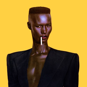
Just adding to this particular point since it's been raised. I've always raised an eyebrow when photographers deliberately darken and de-saturate Black models' skin in post production to the point where they are all but stripped of any unique identity and become mere objects and silhouettes against which to juxtapose colorful garments, bright backdrops, shiny jewellery or garish makeup. The deliberate darkening and use of Black skin as a formal device to be considered alongside backdrop and clothing, and jewellery. Looking at the behind the scenes video that Edward posted, I see a dynamic and beautiful group of Black women, each with distinct personalities and a range of skin tones, but on the group cover and the editorial images, this has largely been muted by the very deliberate post-production that has de-saturated and darkened their skin tones, taking away the rich diversity of Black beauty that these women represent and which is clear in the video. Pavarotti's work exemplifies this trend at the moment, but it has been around for a while and is done both by photographers of colour and white photographers alike so I wouldn't go so far as calling it 'racist' myself, yet I have to admit it's an aesthetic that has always bothered me, regardless of the photographer.Question for poc members: I´m in a FB group where members are not into fashion and have no idea about Pavarotti´s work. Most are raising eyebrows saying this is racist. Do you think it is?
I'd love to get the thoughts of POC members on this and how you interpret this aesthetic, which is really taking off as everyone jumps on the Pavarotti/Kamara aesthetic bandwagon.
Last edited: