Fashion Stylists - Share Your Work, Give & Get Feedback

NöNe - Miss Celie (Make up Music Video)

I've been a Fashion spotter for a few Years and i just wanted to share with you guys my directorial debut and the Debut of my Artist NöNe.
the song and video are inspired by a Beauty shoot we did.
The Message of the Song and video are you don't need surgery to be beautiful just a good "Beat" which is slang for Putting on ones face. there are faces of all races ages sizes and backgrounds. i hope you guys enjoy.
A. Giles

http://www.youtube.com/watch?v=nOUP895CMOU
 
Welcome to the Fashion Spot, Antoine!

When you say "collection" it tells me that perhaps you might be the designer and that this might be posted in the wrong thread. I'd like to clarify it and make this is placed in the correct thread, so we can give our opinions about the part of the work that you actually did.

Are you the designer (your collection that you created) ... or a you a stylist (assembling clothes from an other or several other designers for this photoshoot)?
 
Last edited by a moderator:
Hello BetteT, I'm the designer of this collection, for the whole process from pattern making to sewing. :smile:
I am really sorry if I posted this in the wrong thread! Could you show me the good one?
 
Last edited by a moderator:
Hey guys, I wanted to bump this thread up (can't believe no one's sharing their work here anymore :-( ) and get some critics and feedback of my work as I feel it may help me get better and grow. I did my first editorials a few years ago (actually I posted them here at the time) and just started up again after a year of internships.

These are photos that were published in ELLE men Hong Kong as well as one from Bite magazine and a test shoot.
 

Attachments

  • Capture d’écran 2015-07-30 à 11.35.23.jpg
    Capture d’écran 2015-07-30 à 11.35.23.jpg
    118 KB · Views: 12
  • Capture d’écran 2015-07-30 à 11.35.34.png
    Capture d’écran 2015-07-30 à 11.35.34.png
    496.7 KB · Views: 9
  • Capture d’écran 2015-07-30 à 11.35.45.png
    Capture d’écran 2015-07-30 à 11.35.45.png
    281.2 KB · Views: 8
  • Capture d’écran 2015-07-30 à 11.35.58.png
    Capture d’écran 2015-07-30 à 11.35.58.png
    363.1 KB · Views: 12
  • Capture d’écran 2015-07-30 à 11.36.27.png
    Capture d’écran 2015-07-30 à 11.36.27.png
    410.2 KB · Views: 7
  • Capture d’écran 2015-07-30 à 11.40.53.jpg
    Capture d’écran 2015-07-30 à 11.40.53.jpg
    103.1 KB · Views: 9
  • Capture d’écran 2015-07-30 à 11.40.45.jpg
    Capture d’écran 2015-07-30 à 11.40.45.jpg
    166.7 KB · Views: 9
  • Capture d’écran 2015-07-30 à 11.40.36.png
    Capture d’écran 2015-07-30 à 11.40.36.png
    402.8 KB · Views: 10
  • Capture d’écran 2015-07-30 à 11.40.25.jpg
    Capture d’écran 2015-07-30 à 11.40.25.jpg
    98.5 KB · Views: 9
(hope you guys don't mind the second flock of pictures, also I've just included pieces of each editorial, I didn't want to overload you guys :ninja: the rest can be found on my portfolio (link in signature) if you are interested in seeing them in their entirety... ^_^' hope to hear your thoughts! )
 

Attachments

  • Capture d’écran 2015-07-30 à 11.41.35.png
    Capture d’écran 2015-07-30 à 11.41.35.png
    331 KB · Views: 9
  • Capture d’écran 2015-07-30 à 11.42.11.png
    Capture d’écran 2015-07-30 à 11.42.11.png
    348.7 KB · Views: 10
  • Capture d’écran 2015-07-30 à 11.42.40.png
    Capture d’écran 2015-07-30 à 11.42.40.png
    423.8 KB · Views: 10
  • Capture d’écran 2015-07-30 à 11.43.20.png
    Capture d’écran 2015-07-30 à 11.43.20.png
    414.1 KB · Views: 9
  • Capture d’écran 2015-07-30 à 11.43.28.png
    Capture d’écran 2015-07-30 à 11.43.28.png
    443.2 KB · Views: 9
  • Capture d’écran 2015-07-30 à 11.44.56.jpg
    Capture d’écran 2015-07-30 à 11.44.56.jpg
    133.3 KB · Views: 14
  • Capture d’écran 2015-07-30 à 11.44.49.jpg
    Capture d’écran 2015-07-30 à 11.44.49.jpg
    147.2 KB · Views: 16
  • Capture d’écran 2015-07-30 à 11.44.27.jpg
    Capture d’écran 2015-07-30 à 11.44.27.jpg
    120.1 KB · Views: 15
  • Capture d’écran 2015-07-30 à 11.44.17.jpg
    Capture d’écran 2015-07-30 à 11.44.17.jpg
    111.2 KB · Views: 11
  • Capture d’écran 2015-07-30 à 11.43.52.jpg
    Capture d’écran 2015-07-30 à 11.43.52.jpg
    123.9 KB · Views: 12
Hi Andrea,

Nice to see you posting in here again ... and congrats on those editorials! Well done!! :flower:


Since you asked for critique ... here are my thoughts.

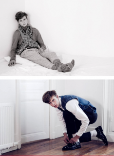
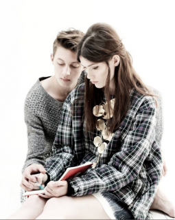
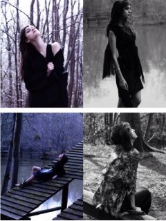
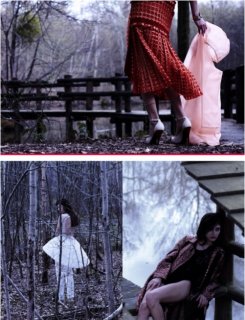
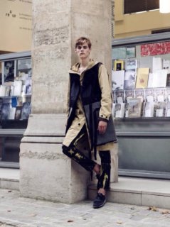
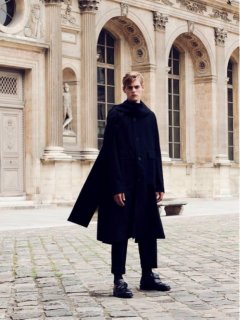
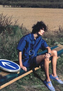
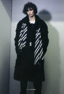
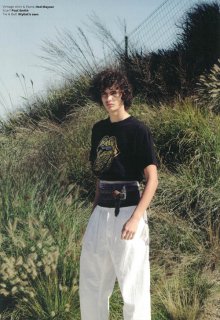
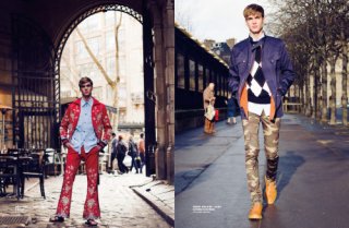
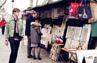
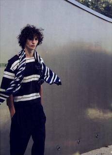
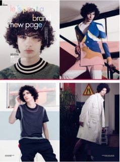
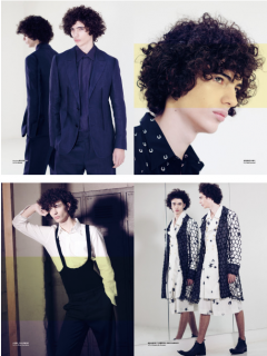
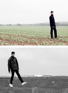
You pulled off a cohesive story for each set, which is something that takes talent. Love the moodiness of the last one and I like the one in the fields ... I like the opposites of an urban look in the country.

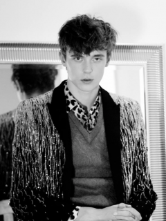
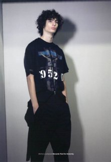
I have one thought (and a bunch of advice about it) that I'd like share ... something that I learned from a photographer. Black is extremely hard to shoot. It usually looks flat and details disappear. it needs special lighting. And since fashion shots are supposed to be about the clothes, seeing the details is pretty important. So, if the photog doesn't light it well, it leaves it up to you, the stylist, to compensate for this problem.

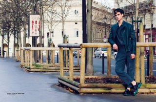
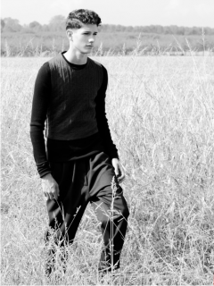
Take a look at the ones where the model is all in black. Can you see the seams, the buttons, the details? If not then that means the photographer did not light it well enough for that shot.

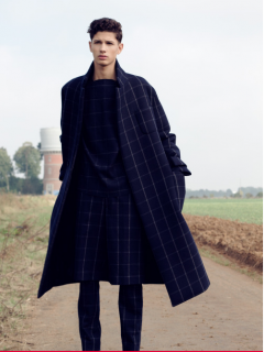
A couple of the shots in the fields showed a lot of details in the black outfits ... just because it was shot late in the day and the sun came from the side. But some of them are very flat looking ... you really can't tell much about the clothing. If you have a good relationship with the photog, and he/she trusts your advice ... tell him/her that there needs to be more side lighting on the black, to make the details show ... a reflector or two on one side works wonders. But ... that's risky to tell a photog how to light his subject (after all, he's supposed to be the expert in how to light the photos) ... so most of the time, you just can't do that. So, as a stylist, when you use black you must assume that the photog will not light it well and it's up to you to make the details pop.


Here are some things that a stylist might think about doing to make black look less flat and more detailed:

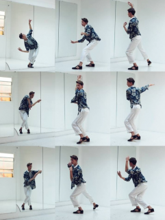
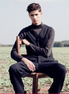
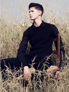
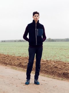
1. Silhouette ... the shape of the clothing can be unusual. You have two that show that quite well ... the two pics on the upper right on the last set... the fabric looks flat, but the shapes are distinctive.
2. Texture .... deep texture, where the ridges and dips will create some contrast, even if the lighting is somewhat flat. A rough texture over a smooth one will make both pieces look different, even if they are both black.
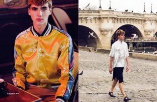
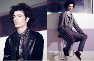
3. Shine ... example:, the one where she's on the roof.
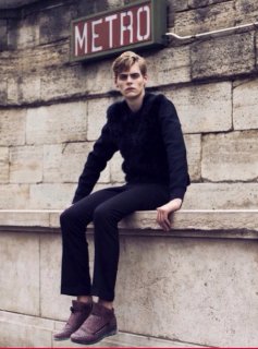
4. Pattern ... example: with the suit with the long jacket, the windowpane plaid adds interest.
5. Contrast ... if you can't mix textures, consider adding a lighter shade of black ... a charcoal or slightly lighter ... so one piece does not run right into the other, visually. For all black looks that consist of more than one piece, you probably want to be able to see that it's a top and pants/skirt ... not just a unitard.
6. Negative Space ... laser cut holes or cutouts showing skin or the a contrasting color underneath.
7. Hardware ... zippers,, buckles, buttons ... anything shiny that might catch the light.

Thanks for sharing ... it's nice to see you back at it. You clearly have talent.
 
Really BetteT, for as long as I can remember reading the forums I've always been so grateful we have you here on TFS, before posting these here I was reading up on some of the other styling and photography pages and your insight and advice is always so valuable!!
Thank you(!!) for taking the time in writing me a developed critic :flower: you are totally right about those photos, I had never figured out how to overcome that issue up to now. I am definitely going to tackle it and work in your tips! Hope to come back next time with better results :-D
 
I You are most welcome! :flower: Glad it gave you food for thought and something to try. :heart:
 
A mag cover I did this year ... it was a fun project because they wanted to incorporate fashion into an interior design magazine

12096068_1633723103582149_752838787011470678_n.png


From Viviendoeldiseño's facebook fan page.
 
(hope you guys don't mind the second flock of pictures, also I've just included pieces of each editorial, I didn't want to overload you guys :ninja: the rest can be found on my portfolio (link in signature) if you are interested in seeing them in their entirety... ^_^' hope to hear your thoughts! )

D O P E :heart:
- what's your name so we can open a thread for ya in BTL ? :cool:

You pulled off a cohesive story for each set, which is something that takes talent.
I agree w this !
Your work shows lots of promise! :flower::flower:
 
Ohhh!
ironic, I got so caught up with work that I only just saw your comment: thank you BerlinRocks!! Its really sweet of you. ❤️❤️❤️ (It's always weird for me to hear it, because I'm such an over thinker and doubt myself constantly especially when I work with new people ^_^' )
I hope to be able to show you guys soon some of the stuff I've been working on lately! (Also my full real name is Andrea de Saint Andrieu )
 
Last edited by a moderator:
A mag cover I did this year ... it was a fun project because they wanted to incorporate fashion into an interior design magazine

See above ... photo edited out.

From Viviendoeldiseño's facebook fan page.
Love this concept! This really gets the attention of anyone who is looking at it ... which is really important for magazine covers.
 
Last edited by a moderator:
Love this concept! This really gets the attention of anyone who is looking at it ... which is really important for magazine covers.

Well, it helps if you have the best possible team and they let you do pretty much anything you want.

The ring the model is wearing is made of concrete and its absolutelly breathtaking. The dress wasnt my fave color and picked it up mostly because of the texture and the sheen. The photog loved how it looked and well, ended up in the cover. All 100% made in Costa Rica design (and team).

Thanks!
 
@Ultramarine: if we are only speaking about colors, I don't mind this green, but I would have maybe chosen a more vibrant one for the cover and kept this one for the editorial. That being said, I definitely get why they chose this picture, the pose is amazing, that must have been such an exciting moment when you guys checked the outcome of the pics! Do you have any other pictures from this shoot? Was the movement/jumping a part of them? :-D
 
I can't believe I've just discovered this thread after being a member forever!! It's so, so cool to get the chance to see my fellow member's work!! I'm going to have to start posting too, although knowing the regard I have for some of the member's opinions on here it's a bit daunting to offer anything up for scrutiny. :shock:

Ultramarine, that cover is so dynamic and I suspect just from looking at it that it was one of those moments that you may not even have processed during the shoot but realized when looking at the photos afterward that you really got something beyond.

Andrea.RL, it's a bit after the fact but those stories you posted over the summer are really gorgeous. I especially love what you've done with the menswear, and I have a tremendous amount of respect for any stylist who manages to do something striking with men's fashion as it's definitely not my forté. I totally echo what Bette had said about photographing black, because it can be so impossible to work with effectively, but I know all too well what it's like to try to capture a mood or a trend and NOT use it, especially in fall/winter stories. Even still, it's beautiful work, and I love the mix of those sort of pastoral backgrounds with the very urbane, sleek menswear you chose.
 
Thank you spike413!! :heart:

Didn't you want to share some of your pics? ^_^
I don't really have friends that can give me opinions or critics about my work, so I really appreciate everyone's feedback and want to continue posting here, but I feel weird being the only one doing so... ^_^'

Here are a few pics from recent editorials that came out. I know there are some problematic looks in the batch... I also did a few go sees, but obviously they are simple, I don't know if there's a point in sharing those. (first ones were for vanity teen and the second for elle men hk)
 

Attachments

  • tumblr_nykb35ozqJ1r0cbibo5_500.jpg
    tumblr_nykb35ozqJ1r0cbibo5_500.jpg
    179.4 KB · Views: 13
  • tumblr_nykb35ozqJ1r0cbibo4_500.jpg
    tumblr_nykb35ozqJ1r0cbibo4_500.jpg
    75.2 KB · Views: 10
  • tumblr_nykb35ozqJ1r0cbibo3_500.jpg
    tumblr_nykb35ozqJ1r0cbibo3_500.jpg
    72.3 KB · Views: 9
  • tumblr_nykb35ozqJ1r0cbibo2_500.jpg
    tumblr_nykb35ozqJ1r0cbibo2_500.jpg
    109.7 KB · Views: 11
  • tumblr_nykb35ozqJ1r0cbibo1_500.jpg
    tumblr_nykb35ozqJ1r0cbibo1_500.jpg
    186.8 KB · Views: 14
  • tumblr_o26mm7uFlw1r0cbibo1_500.jpg
    tumblr_o26mm7uFlw1r0cbibo1_500.jpg
    81.7 KB · Views: 13
  • tumblr_o26mm7uFlw1r0cbibo2_500.jpg
    tumblr_o26mm7uFlw1r0cbibo2_500.jpg
    90.1 KB · Views: 13
  • tumblr_o26mm7uFlw1r0cbibo3_500.jpg
    tumblr_o26mm7uFlw1r0cbibo3_500.jpg
    89.9 KB · Views: 9
  • tumblr_o26mm7uFlw1r0cbibo5_500.jpg
    tumblr_o26mm7uFlw1r0cbibo5_500.jpg
    97.2 KB · Views: 11
  • tumblr_o26mm7uFlw1r0cbibo6_500.jpg
    tumblr_o26mm7uFlw1r0cbibo6_500.jpg
    84.2 KB · Views: 10
Hi Andrea,

It always seems to be me, but then I love to analyze this sort of thing.

So ... here are my thoughts:

First Editorial (the photographer's call, not yours ... but the 3rd and the 4th look like they were shot in a studio, not on location ... the lighting and the fact that you can't see the ground makes them look like they are from another editorial:(

Love the first two and the last of the five looks a lot. For these reasons: Love your creative use of the belt/tie/scarf combo in the first one. Also like the slouchy, beachy look of the second one and the fifth is equally beachy and relaxed .. you just nailed it.

The third is pretty much a repeat of the first .... perhaps not needed. I I like the third one with the coat but it seems like it's not from the same story ... because the other three are all slouchy pants or shorts with very casual shirts ... beachy, sort of.

This one with the coat takes it to a more of a city vibe and into another story, to my eye. But ... I'm very interested in the belt under the coat ... would love to see it, so if the coat was open, it would be better ... but then that would be up to the photographer, not you.

Paris Editorial ... impressive!

Of course, the location helps, but your choices are brilliant for the most part. Layered, mixed patterns, colorful ... with a young and creative vibe. Only one suggestion ... since the he's wearing jackets in all of the other ones, the last one with the shorts (skirt?) sort of seems out of place. Up to that point, it looked like it was a chilly winter day in Paris (I see the trees have no leaves) ... so what's this guy walking by the river in summer clothes? But all in all ... great work! (Photography is really good in this one too ... kudos to you both.)
 
Last edited by a moderator:
ahh BetteT! <3 you're one hell of a mentor :wink: :D:clap:

I totally see what you mean about the first editorial! I was kind of bummed because my idea was to do a romeo + juliet story like the leo movie, I had ideas of poses to reference the movie and I brought some neons, tons of candles etc for the interior pics, but they were never used/experimented with..
You're right about the coat too: I saw an outtake of that look without the coat and it looked pretty cool (there was no belt it was just the shirt :-P ) and maybe would have made more sense? (I attached it to my post)

As for the second one: THANK YOU. It's funny because I didn't notice the jackets vs one tshirt thing until you mentioned it! I will keep an eye on that kind of detail from now on :-)
"Of course, the location helps" : I think the location definitely has a lot to play here, the photographer takes great pictures and with the pairing of look+location it turned out nicely, but I know that if we were somewhere else it could have turned very flat, due in part also to the fact that the poses (even though he walks in some pics and stuff) are very still(?)
 

Attachments

  • Capture d’e?cran 2016-03-27 a? 11.58.44.png
    Capture d’e?cran 2016-03-27 a? 11.58.44.png
    317.3 KB · Views: 11
Last edited by a moderator:
It takes more than one set of eyes to notice things ... so that's why feedback can be helpful. Glad to help.

Yes! ... the outfit without the coat totally works ... and love the scarf as an accessory, too! I had no idea it was the shirt I was looking at .... I like that shot a lot better anyway ... doesn't look like it's in the studio anymore.

Sometimes stylists cannot control things ... the photog usually has veto rights and we just have to go along with it and do the best we can. It's so wonderful, on those rare occasions, when both of you are on the exact same page ... and you have the same vision! That's when magic happens.

I can see your point about the model being a bit stiff ... but I didn't notice, TBH. (low res, small pics, so I didn't get a great look at his face). What I did notice is what the photog did with the depth of field (not the focus, more like the sharp angles of the streets in the background) in most of the shots, and that he cropped the images so that they were asymmetrical ... which ads a dynamic feel to the whole thing. So all of that helped make up for any deficiencies in what the model was doing, I think.
 
Last edited by a moderator:

Users who are viewing this thread

New Posts

Forum Statistics

Threads
210,772
Messages
15,127,528
Members
84,501
Latest member
annetbef
Back
Top
monitoring_string = "058526dd2635cb6818386bfd373b82a4"
<-- Admiral -->