
Andrea.RL, I feel your pain with a concept being disregarded thing. I'm technically not a stylist but an editor, and even still I've had those situations where the photographer takes the concept and just goes in their own direction with it even when you're trying to get them to give you what you want. It's such a frustrating feeling, probably the part of the job that bothers me the most. But I'd say that you still did a really strong job with the styling in spite of your vision not being used more.
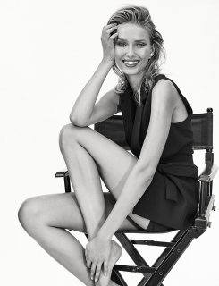
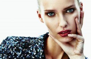
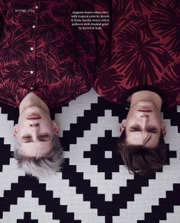
I also love the color you managed to work with in the Paris story. Looking at the editorial as a whole, instead of page by page the way you would in a magazine, it just looks really vibrant and light.
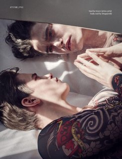
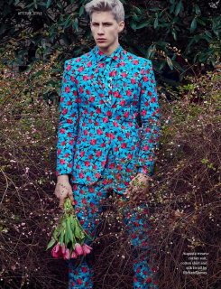
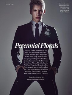
I've always found male models more challenging to work with than female models when I've had to use them. I think it's something to do with portraying something that's considered "masculine" that inhibits them or inhibits photographers or art directors or whomever it is directing them from really pushing them past a sort of limited range, and that limited range can so easily read as stiff. But like Bette said, it really doesn't stand out to the viewer the way it might to you being that you were on hand watching the model work and probably noticing what you didn't like.
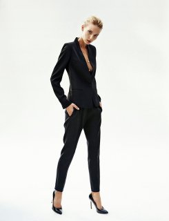
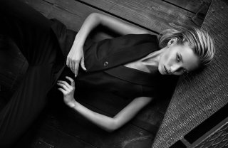
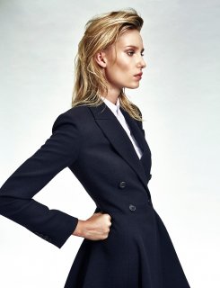
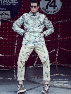
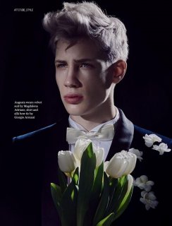
I'm still waiting to get hi-res images from my recent Spring story for the magazine I work for (which is bi-annual), but figured I'd throw my last one up for consideration. It was actually a similar case as yours Andrea, where both my editor in chief and the photographer veered away from the concept, which was supposed to have been inspired by the walk of shame. Locations that were scouted were cut, and I was told that I had to de-grunge the overall look a little bit, which was definitely discouraging because I really don't think the concept really came through loud and clear the way I'd envisioned it. The men's looks involved...I was sort of forced to mix them in because TPTB wanted a men's presence but I wasn't thrilled with them and I've sort of divorced myself from them creatively lol. Same with the white framing.
Still, I was overall pretty happy with it. Would love to hear both of your thoughts!


I also love the color you managed to work with in the Paris story. Looking at the editorial as a whole, instead of page by page the way you would in a magazine, it just looks really vibrant and light.
I've always found male models more challenging to work with than female models when I've had to use them. I think it's something to do with portraying something that's considered "masculine" that inhibits them or inhibits photographers or art directors or whomever it is directing them from really pushing them past a sort of limited range, and that limited range can so easily read as stiff. But like Bette said, it really doesn't stand out to the viewer the way it might to you being that you were on hand watching the model work and probably noticing what you didn't like.
I'm still waiting to get hi-res images from my recent Spring story for the magazine I work for (which is bi-annual), but figured I'd throw my last one up for consideration. It was actually a similar case as yours Andrea, where both my editor in chief and the photographer veered away from the concept, which was supposed to have been inspired by the walk of shame. Locations that were scouted were cut, and I was told that I had to de-grunge the overall look a little bit, which was definitely discouraging because I really don't think the concept really came through loud and clear the way I'd envisioned it. The men's looks involved...I was sort of forced to mix them in because TPTB wanted a men's presence but I wasn't thrilled with them and I've sort of divorced myself from them creatively lol. Same with the white framing.
Still, I was overall pretty happy with it. Would love to hear both of your thoughts!
 ' im pretty sure the guy could relate to what you just mentioned :-P
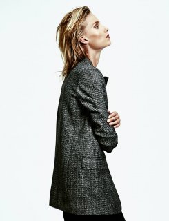
 We get a lot of viewers who want to learn all about styling.


 I'm just not sure about the jeans, you can see they are a rougher fabric than all the rest but other than that.